connection by luka gobin from croatia
designer's own words:
moleskine is a unique brand that although has a short history, its roots go much deeper it the past. this is a dedicated company that has ensured in a special way for many people to write their ideas, stories and adventures. In accordance to that, we moved on to consider what kind of logo would be appropriate to represent a blog of the brand like moleskine.
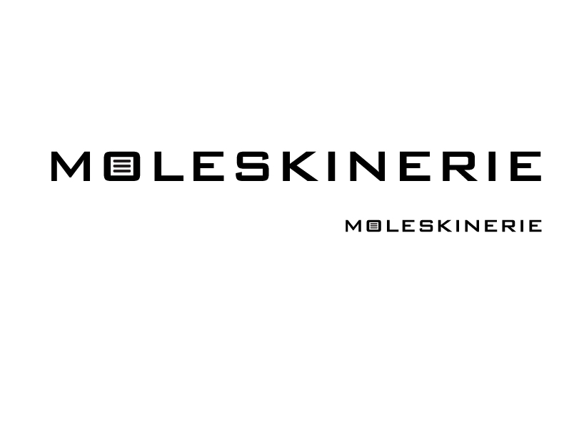
the concept started by analyzing the current identity of moleskine, which, at present, contains the font copperplate gothic, which is not really sans-serif as it stands in the name because it has a small, peculiar serif that perfectly complements the strength of moleskine identity.
next, the idea was to find a similar but yet "softer" font, which should seek to maintain the fundamental attributes of the current font, and likewise, to add new features that moleskinerie blog brings. after searching for some time, we chose the bank gothic font, font that is quite similar to original, and on the other hand square shaped, so it gives us the possibility to play with certain symbols. the mere fact that bank gothic font is indeed sans-serif, it's softer, and because of that it offers almost imperceptible transformation from tangible writing material, like moleskine notebooks or diaries, into more 'softer' virtual version, for moleskinerie blog, the place reserved for all moleskine lovers.
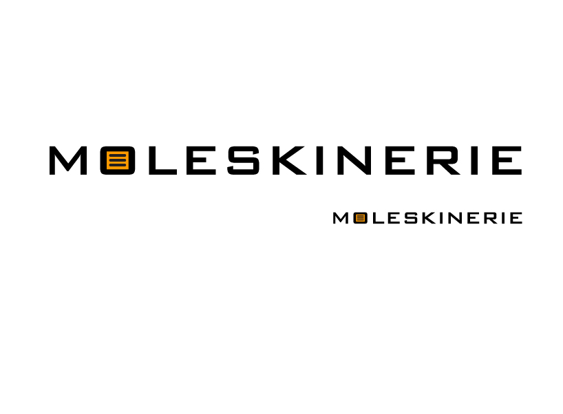
besides the fundamental attributes of the current font, an attempt is made to retain the simplicity and minimalism. because of that, the emphasis is placed only on one part, but we reckon that it is more than enough to point out the meaning. the letter 'o' which essentially is already square shaped consolidates with lines to represent the written text, which is also the direct link between writing on paper and writing on computer. Aaso, the lines can be interpreted as a link between the previously mentioned entities, to further stress out the function. moreover, the orange color is selected, because, in moleskine world, it represents the notebook with lines which serve primarily for writing, same as moleskinerie blog.