simona dolinga moleskinerie logo #2 by simona dolinga from serbia
designer's own words:
the moleskine is a storage that keeps all the things to do with the mind and creativity - ideas, writing
and drawing, organising, traveling, memories...
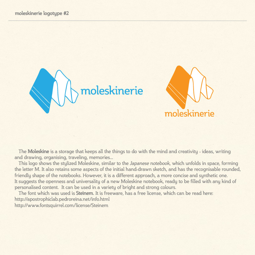
this logo shows the stylized moleskine, similar to the japanese notebook, which unfolds in space, forming the letter m. it also retains some aspects of the initial hand-drawn sketch, and has the recognisable rounded, friendly shape of the notebooks. however, it is a different approach, a more concise and synthetic one. it suggests the openness and universality of a new moleskine notebook, ready to be filled with any kind of personalised content.
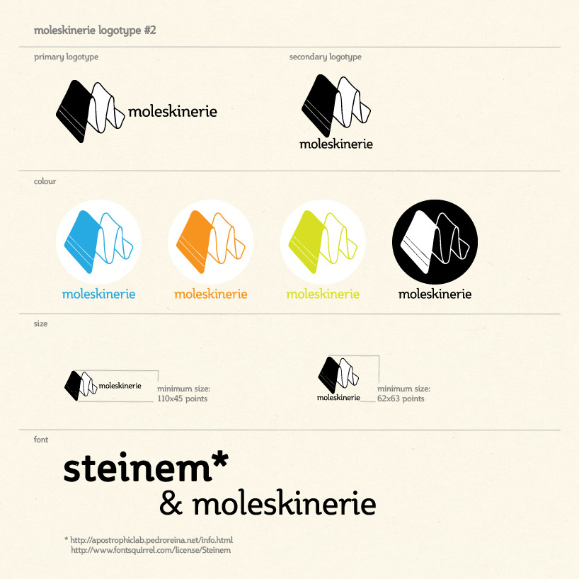
it can be used in a variety of bright and strong colours.
the font which was used is steinem. it is freeware, has a free license, which can be read here:
http://apostrophiclab.pedroreina.net/info.html and here:
http://www.fontsquirrel.com/license/Steinem

