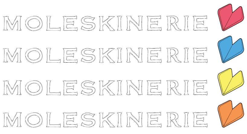
Moleskinerie Logo 2011 by anton annala from finland
designer's own words:
My logo proposal is a easily recognizable text and small logo combination. The main idea was to
combine the elements of visual world of Moleskine to the creative internet environment. On the Moleskinerie blog there are people that are very passionate about Moleskine and use it as a part of their artworks and share them with others. The hand written look of the Moleskinery text in the logo presents the idea of visualize things to a Moleskine sketch book. The Moleskine book forming a heart shape gives us a feeling of commitment and passion of Moleskine users.
Color variations
 Single color bw
 Detail of the font
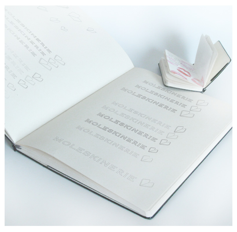
 Mood picture
 Text
Text
shortlisted entries (2162)