Moleskinerie blog logo by menno oosterhuis from netherlands
designer's own words:
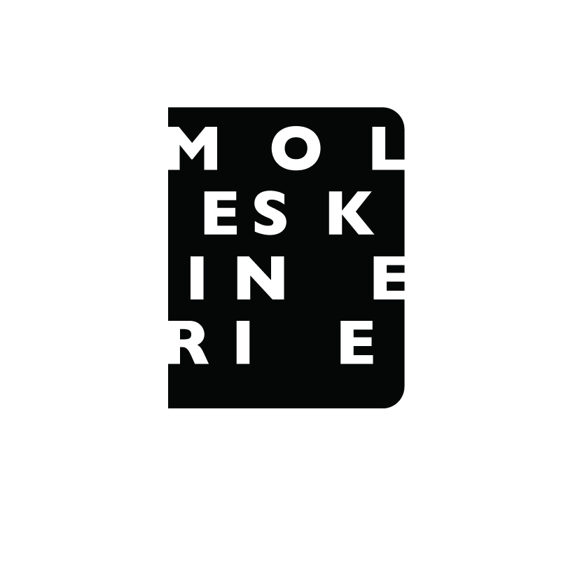
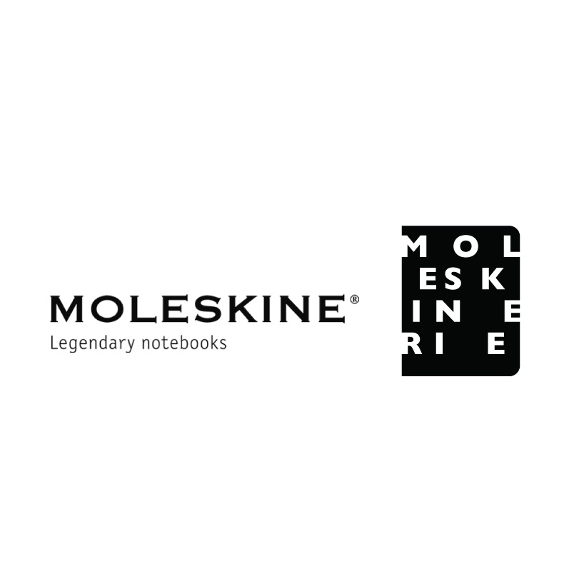
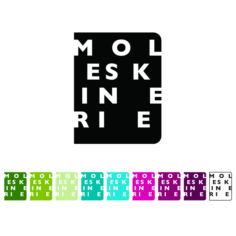
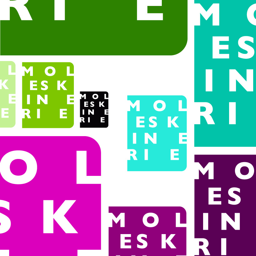
The Moleskinerie logo I designed has a beautiful and strong contrast with the Moleskine logo. Still the Moleskinerie logo refers clearly to the Moleskine brand. The logo reads Moleskinerie like you would read a book or a blog text. The interspacing of the Moleskinerie letters give a random feel of freedom, but are composed with care. An interesting composition in letters and space. The Moleskinerie tekst is placed om an abstract shape of a Moleskine book. This gives a very recognisable and strong image. The logo is executed in single colour and can be used in every possible colour.
shortlisted entries (2162)