IN! by nuria vich from spain
designer's own words:
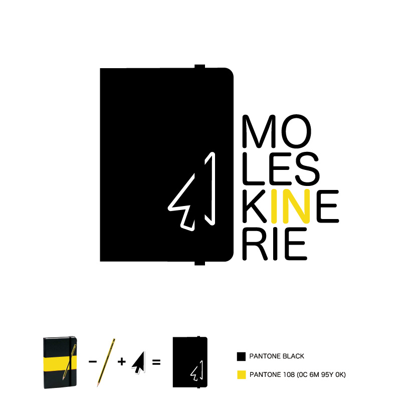
the moleskinerie blog symbolizes a moleskine notebook page. so i created a logo of a notebook
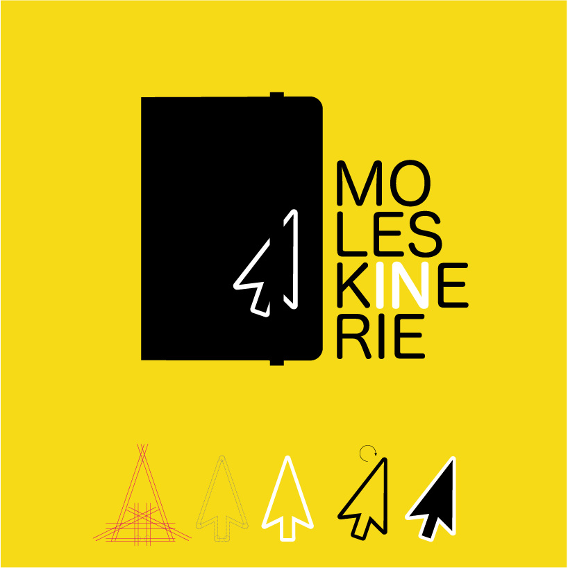
and replace the stylus cursor arrow internet. a cursor that is simple, subtle, conceptual, direct, positive (looks up), original (pointing to the right, into which opens the book, does not mindgoing against) and has the stamp moleskine: the ribbonelastic. it's what makes you unique.
but most important are two things:
1. the arrow points to the word in, part of the name and bothhave positive meanings.
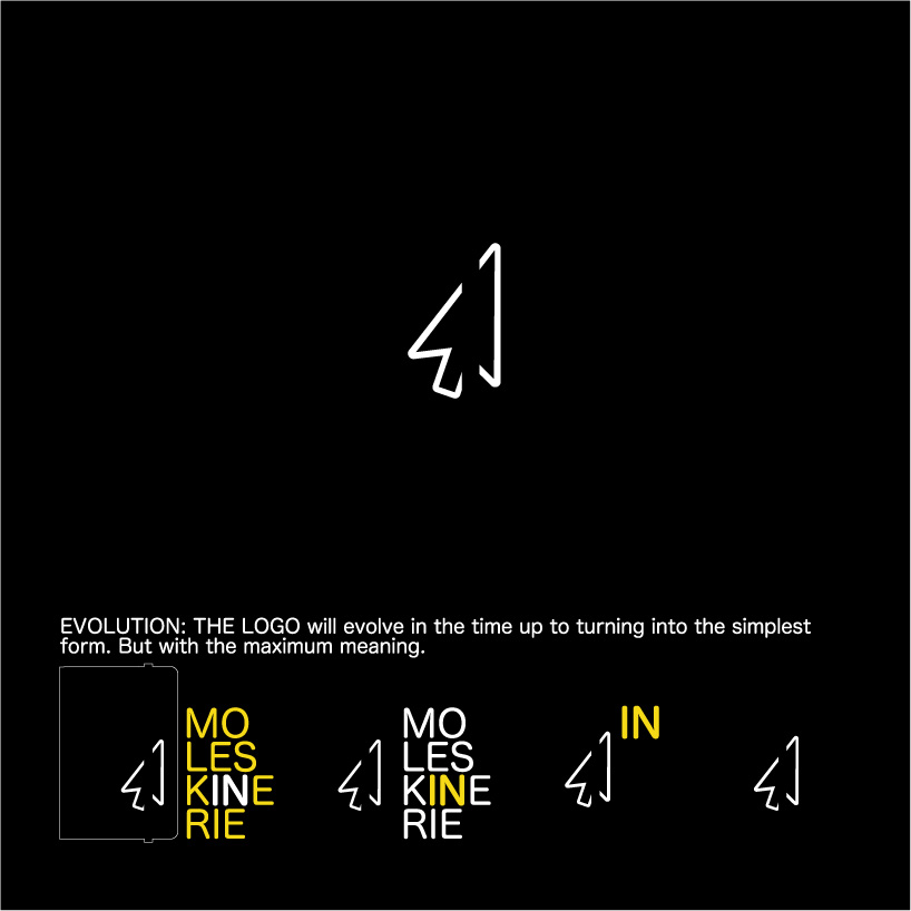
2. that logo is a versatile, ready to evolve over time. as the blog evolves and takes shape, the logo may be emitting elements without losing its meaning: it will be simplified without losing meaning. the final symbol is the minimum, but with maximum meaning: is the "arrow moleskinerie." the one that always has something interesting to report.
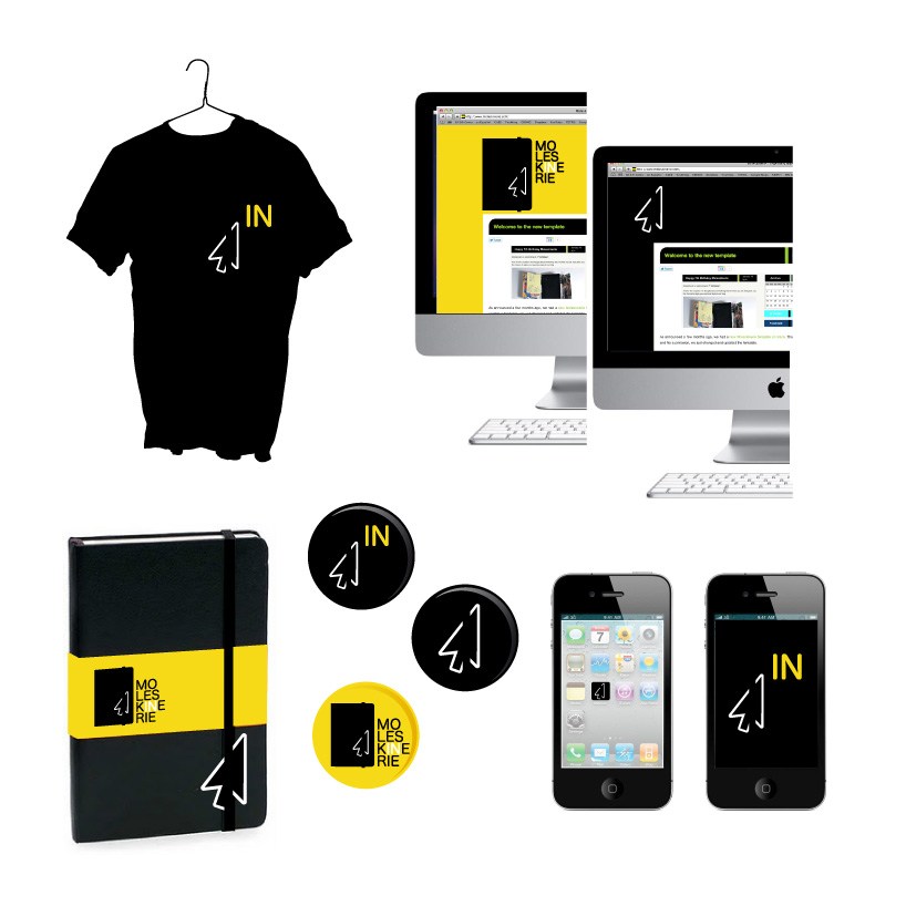
it is very important to know that all the phases of the logo, will coexist in time and in different applications. will overlap depending on the applications until after a time, just left of the arrow.
IN1
 IN2
IN2
 IN3
IN3
 IN4
IN4