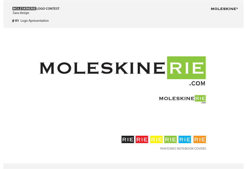
Moleskinerie sara logo by sara vazpinto from spain
designer's own words:
When creating this logo I could not ignore the strength and presence of the brand as well known today for us - Moleskine.
The Moleskinerie intends to be an extension of the original brand respecting its own simplicity and graphic maturity. In this sense, I chose to maintain the typography.
The identity and independence of the Moleskinerie begins on the last three letters "RIE" which assume in a dynamic way its expression as a brand.
Inspired by the colorful covers of Moleskine notebooks, and in order to innovate the new brand, I have created a frame around the "RIE" letters that strengthens and protects the existence of itself.
I allow the random use of the different pantones of Moleskine covers to be used on the frame. The letters “rie” appear cut out of the frame so they can express themselves differently on each background, either digital or printed.
It is thus an easily recognizable brand, but with its own autonomy and dynamism.
Moleskinerie is intended to be a legendary blog!

