Moleskine x aceziah by flores francisco from france
designer's own words:
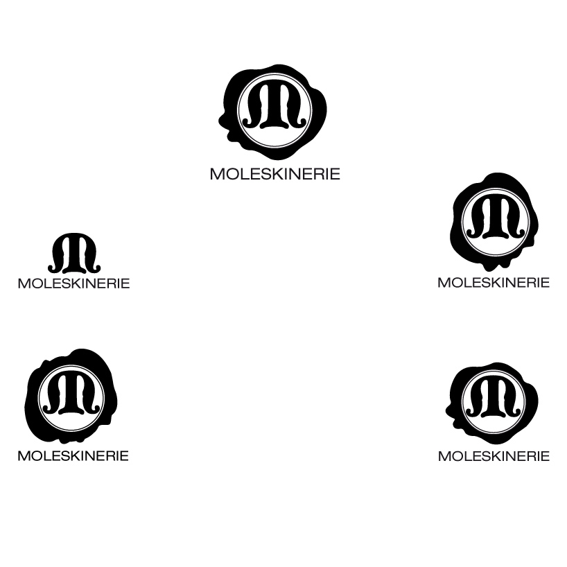
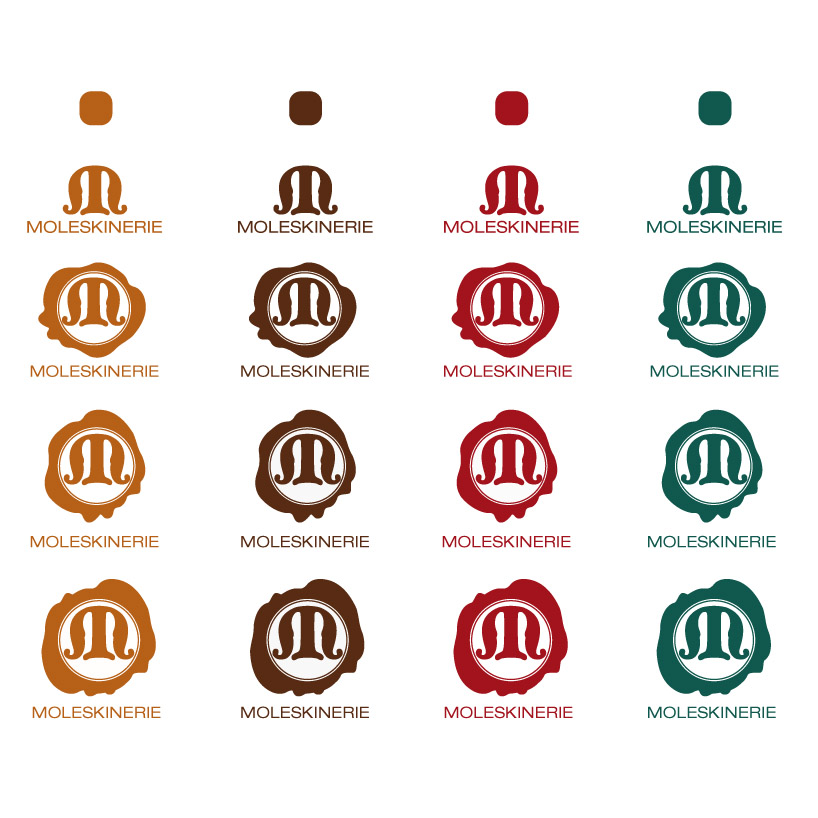
thinking about the essential guideline of the project, i figured that Moleskine departs from other brands mostly by its huge historical weight and by the simplicity of its concept. thus, my logo focuses on the ancient, noble and classical side of the brand, using the image of the stamp. the simple and uncluttured design sticks with the usual style of the brand. origine , premiers logos. in order to show its brighter side, think it may be more approriate for the logo to be in relief, that way it would emphasize moleskine’s stature in history.
shortlisted entries (2162)