rubber line/band by diego garcia from spain
designer's own words:
moleskinerie is a meeting point on the internet for all the moleskine notebook users and for those who, without having one, share the same tastes with them. they are people who are always either writing or sketching or creating anytime, anywhere.
this design is inspired by them, adapting what moleskine represents to a logo: its iconical image and philosophy.
these are the keypoints of the design:
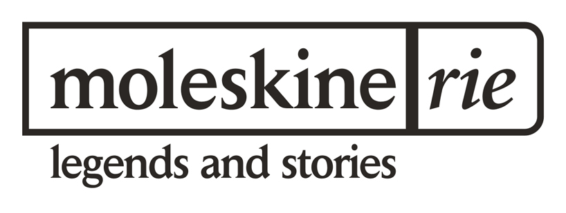
- the shape of the moleskine notebooks are related with the logo. the box around the word ‘moleskinerie’ shares the shape of the typical rounded corners of the moleskine notebook.
- the color of the logo is a very dark grey – 0c, 0m, 0y, 90k-, which gives to the moleskinerie blog a reliable and honest look.
- there are 2 different typographies in this logo: for the ‘moleskine’ letters, it is used daily news bold font and for the ‘rie’ letters, it’s used minion italic bold. it’s a mix between the elegance of these 2 fonts and the strenght of the daily news font with its sharp serif.
- the rubber band of the moleskine notebook is represented by using a thick line between the letters ‘moleskine’ and ‘rie’. people can easily relate moleskinerie wih moleskine and there is a visual effect between the two different fonts, each one in the opposite side of the line.
- the subtitle “legends and stories” is included in the logo too. it doesn’t minimize the importance of the word ‘moleskinerie’ and it has a right size in order to see it properly. it’s perfectly integrated into the logo because its size is related with the size of the ‘moleskine’ letters.
the logo is designed to be shown in positive and negative colours and to be clearly viewed even in very small sizes.
logo
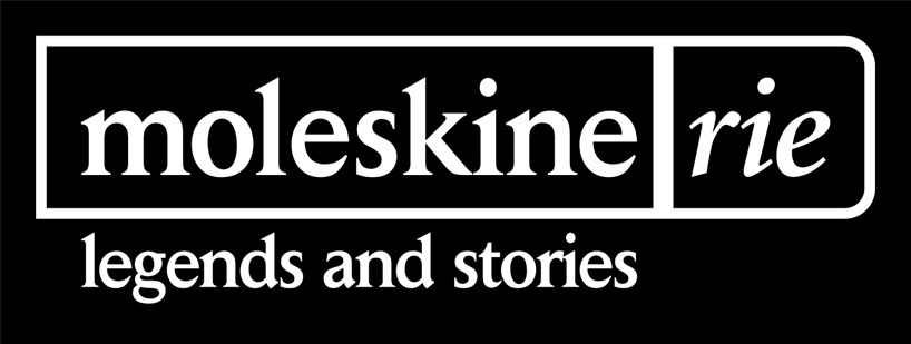 logo negative
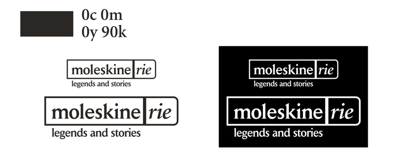 sizes and colour