new moleskinerie logo, continuity with change by andrea martino from argentina
designer's own words:
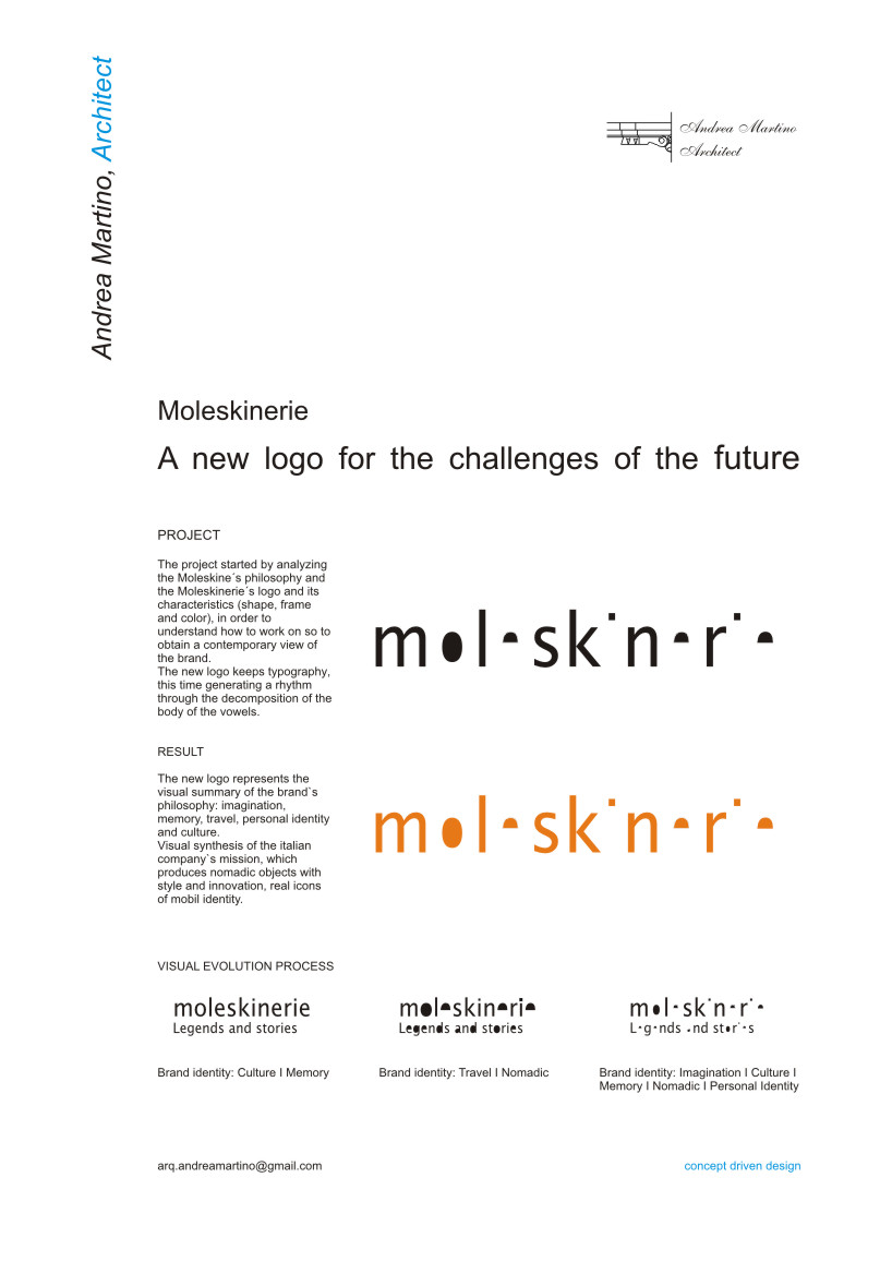
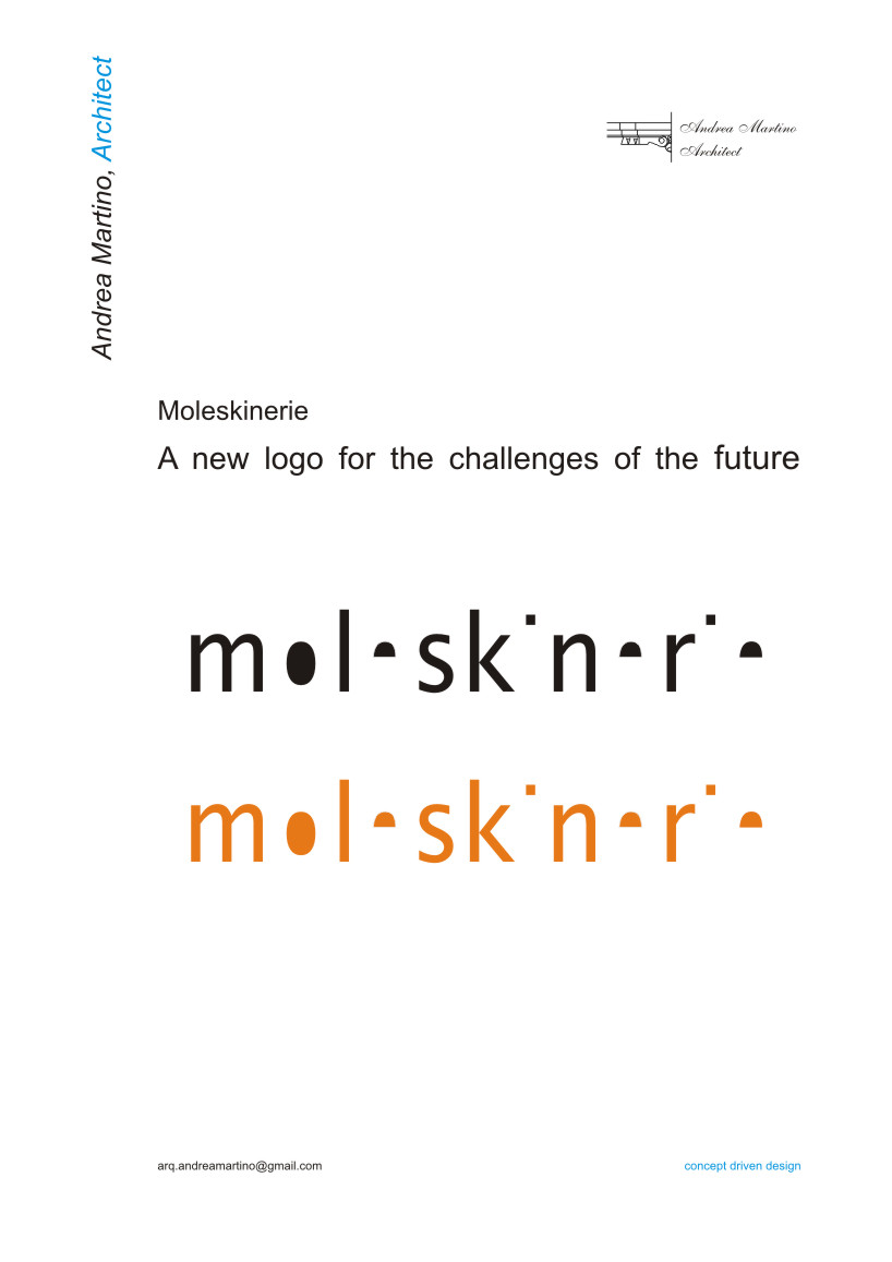
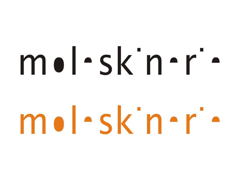
the project started by analyzing the moleskine´s philosophy and the moleskinerie´s logo
and its characteristics (shape, frame and color), in order to understand how to work on, so to obtain a contemporary view of the brand.
the new logo keeps typography, this time considering so important the paper role as the fonts,
generating a rhythm through the decomposition of the body of the vowels.


shortlisted entries (2162)