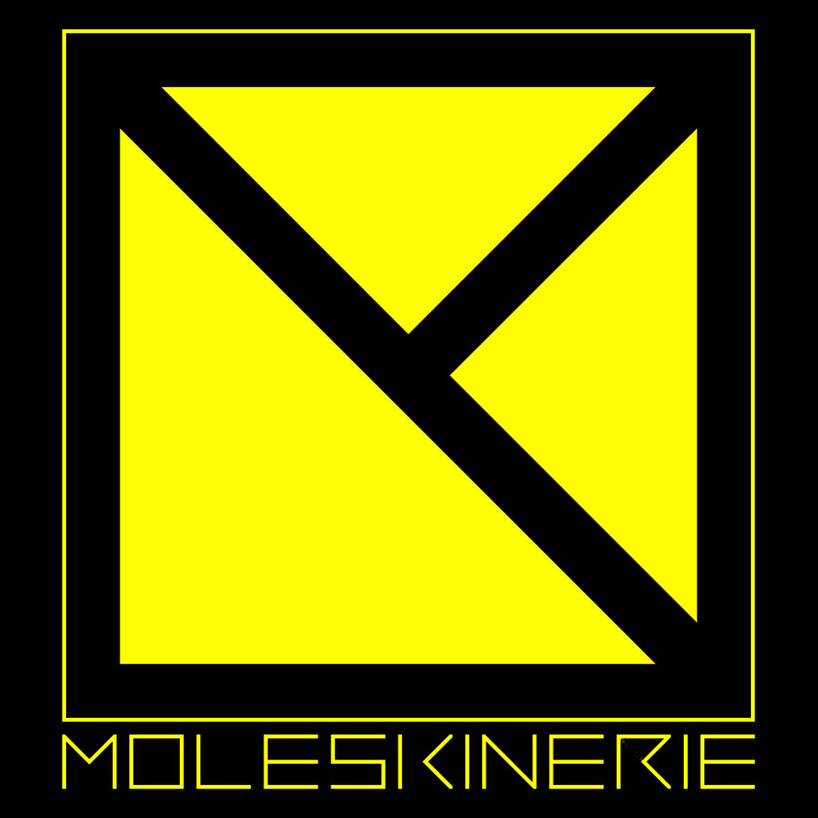
MK envelope by marcoemilio perugini from italy
designer's own words:
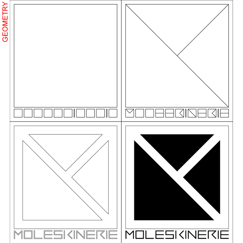
The aim of the design is to make a symbol which can be immediately recognizable, referring to the products of stationery and make the initial letter of the word Moleskinerie visible as well.
A square is divided in three triangles which transforms the figure in a closed envelope. At the same time the lines of the triangles make the letters “M” and the “K” identifiable as part of the name “Moleskinerie”.
All the letters of the word Moleskinerie, written under the main Logo, are based on the geometry of the square and triangles.

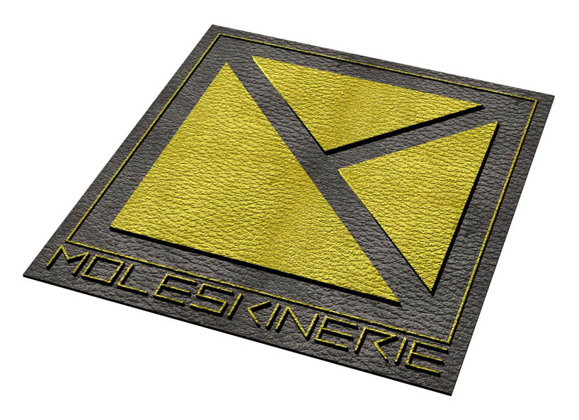
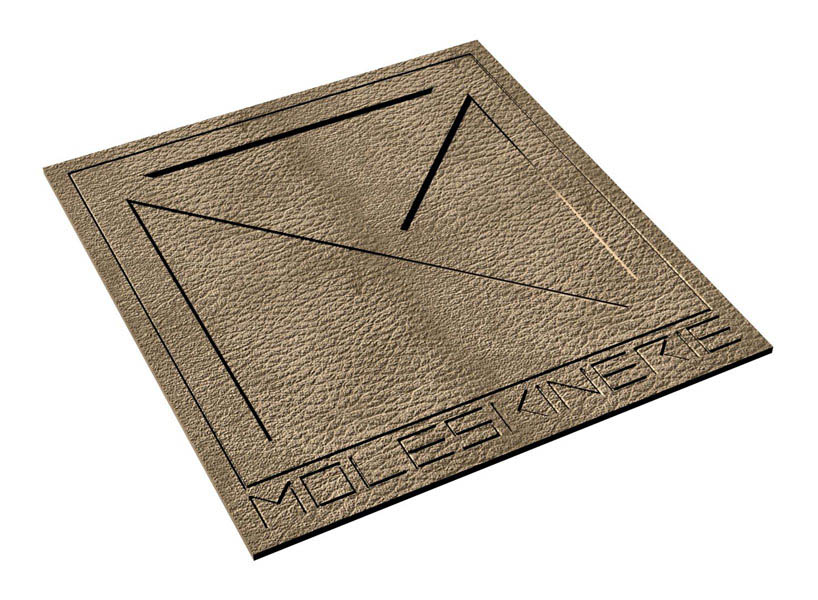
shortlisted entries (2162)