moleskinerie_tape by carolina barbosa from portugal
designer's own words:
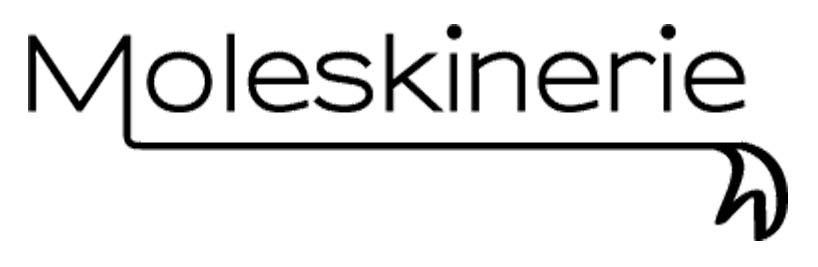
This logo meets the original logo (the notebook's symbol) but in a simpler version for web use.
The "M" is wittingly open in order to resemble an open book without being too graphic.
The dots on the "I's" are just a bit bigger than expected to give the impression that they were hand writen and not written by a typewriter or printer.
The "M" extends to the full lenght of the logo, ending in a shape of a tape, that symbolizes the tape in the note and sketch books. It was hand designed since most moleskine users are connected to arts.
In order to make the logo a bit more modern and "light", I used a sans serif typeface, although I maintained the black color to give the logo some integrity, meeting the moleskine image.
shortlisted entries (2162)