Moleskinerie by loquaz by loquaz Loquaz from brazil
designer's own words:
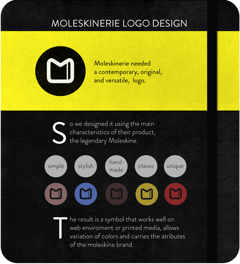
Our proposal has the main focus the Moleskine ® business and all the concepts related to its products. In order to achieve our objectives, we have sought to better understand the values and history of the business as well as to observe all the details that differentiate and contribute to the success of the company's notebook business.
We have identified as the main features of the visual identity to be addressed in your website: classic, manual, simple, practical, stylish and unique. Based on this diagnose we began to use the design principles and processes in order to translate all those attributes to a unique symbol that can be easily recognized by the Moleskine ®public.
As a result, we obtained a versatile symbol, designed with the legendary signature Moleskini style. The symbol displays the letter “M”, the initial of both the business name and its website. Clean and contemporary, the it is of easy assimilation in digital and printed media. The brand makes use of the circle representing motion, agility and innovation- all the features related to the website's message, giving the idea of infinity and cycle .