BACK TO THE ORIGIN by georgina G! from spain
designer's own words:
logo_1
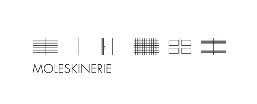
Moleskinerie.com have been created to allow evreyone to express their
thoughts, their "passions, their adventures, their
experiences.Evreything that involves ideias and the way they express
them on their moleskine." But a Moleskine is not just a simple
notebook for scketching. We can write and calculate, we can paint and
drawn, we can even explore, share and store. But all of these is
allowed by the guide lines. The ideia of the logo was to express all
these diferences, in other words, it is diference that make the
multidisciplary aproach. Furthermore is these diversity that
Moleskinerie wants to share.
Blog with Moleskinerie.
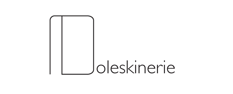
logo_2
The power of the notebook ¡!!
The first letter of a Word can dictate the meaning of it.
What is moleskinerie? A blog is based on everything that involves your ideas and the way you express them on your notebooks…
Even if we are not anymore using the traditional way to talk, the blog still wanted to communicate the spirit of the Moleskine.
Following the philosophy of the blog we would give to the M the power to represent the logo. How come? Making with the notebook the letter M.
The typeface choosed for the rest of the logo is Gills Sans. This typeface express the modernity of the blog, but the values of Moleskine.
logo_1
 montage_2
 logo_2
 montage_2