streck by david qvick from sweden
designer's own words:
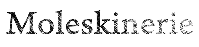
we started the project with the idea of a merge between two elements or techniques - the computer created, and the hand-made. it was crucial the the moleskinerie logotype didn't
feel solely artificial, that it had that hand-made feel to it as well. therefore we worked as long as possible on paper, with pens and brushes etc. the logotype's theme is directly inspired by the art of "sketching" that is synonymous for the moleskine brand. the nest step was to optimize it for the computer screen. to have it work equally well in a smaller, as well as in a larger format, without loosing it's main expression.
streck
shortlisted entries (2162)