João Jorge Magalhães by João Jorge Magalhães from china
designer's own words:
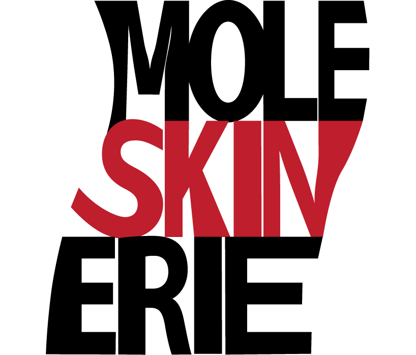
the highlighting of the word "skin" in the logo appeals to what is, in my opinion, one of the characteristics of moleskinerie: more than a brand of notebooks, it's almost a movement, a shared feeling that gets in the skin of writers, artists and many others, in their way to creation.
my logo is inspired in the lettering. moleskine is itself a strong word, an icon, so, I think the logo should be something concise and clean, simply playing with the position of the letters to show the essence of the brand.
the form of the logo is inspired in a paper sheet from a moleskine notebook, trying to give a little sensation of movement, like it was written in that sheet.
as for the colours, they are simple and clean. I chose the black and the grey or the red, as these are colours usually present in moleskine notebooks. in my opinion, the moleskinerie website could show something inspired in the past but, at the same time, translate something modern, in trying to be the new skin of a great icon.
logo
 black
black
 white
white
 color background
 color
color
 color 2