Moleskinerie by beto lopez from mexico
designer's own words:
my process started by having a look on my own relationship with moleskines. this relationship has been ongoing since i started college, it has allowed me to capture creativity and ideas in any scenery.
i then thought of the product and brand, the result of this had to be fresh, versatile and clearly represent both the function behind the product as the idea behind the brand.
i was certain that this logo had to make clear what moleskine allows us to do: sketch, log and doodle whatever came to mind, whenever it comes. i noticed this sudden annotations came unannounced, so the rush and spontaneity had to come off clearly, and since the logo is for the blog, it had to have a technological feel to it.
so then on my sketching and briefing process, i came across two basic ideas:
the first one that the product should be included somehow into this logo, and the second, that it should somehow represent the ability to "capture" a thought and make it achievable.
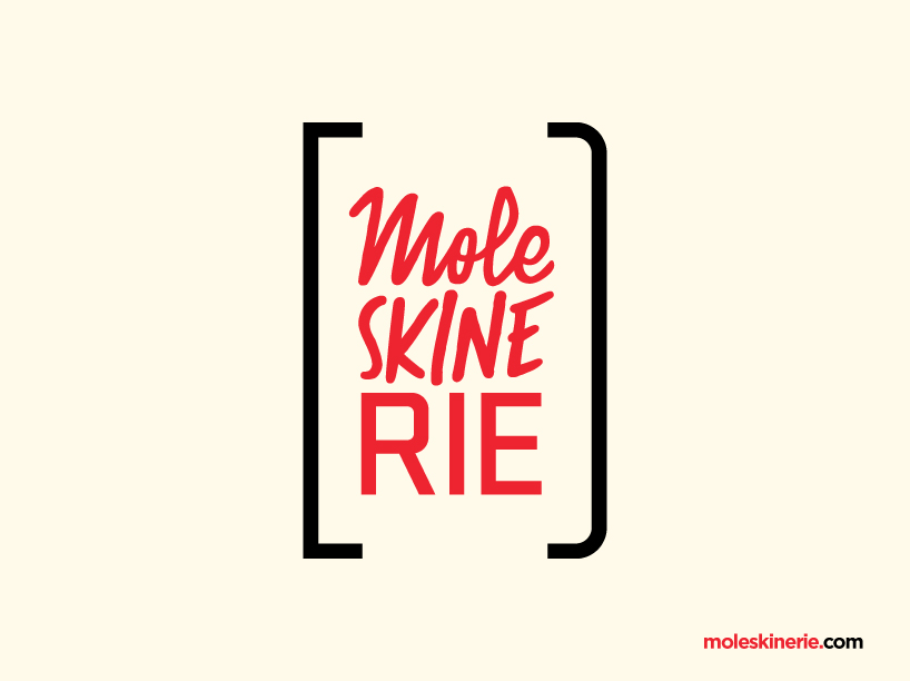
the final process began when it came clear, that different personalities had to come clear in the logo, as the wide public that uses moleskine. this was achieved using some "sketchy" and distinct lettering on the typographical part of the logo. the suffix "rie" was then typed on a geometrical font that could represent the "technological" feel of a blog. at last, i had to find a way to abstract the personality of the product, and include it here. sketching around a couple ideas, i realized that if drawing the perimeter of a "classical moleskine", the extremes could represent brackets, a typographical way of enclosing ideas and thoughts. it all became cohesive putting the name inside the brackets-moleskine sign. the color i added was an intense red, that stands for the passion behind this process of hunting for ideas, the great excitement that an idea generates and how it moves us.
Full Logo
![]() Logo Application on Blog
Logo Application on Blog
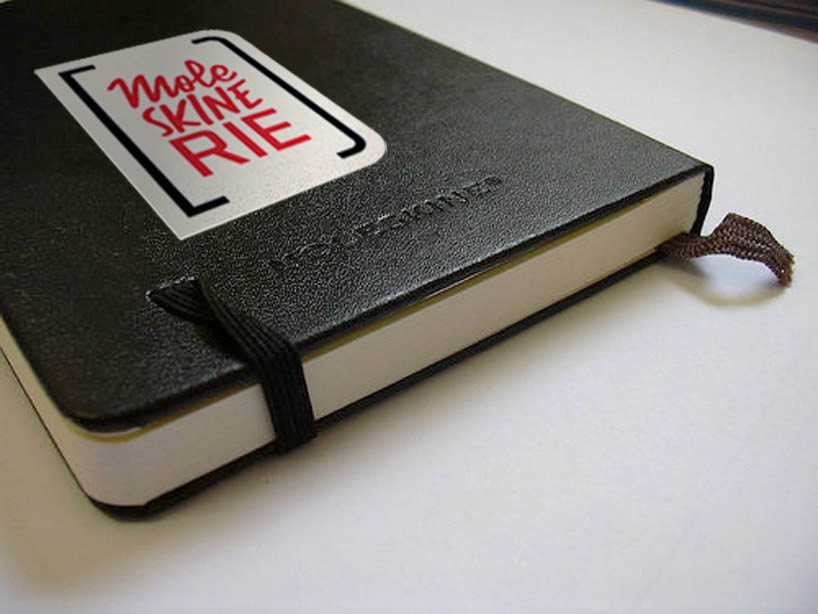 Sticker on Notebook