new moleskinerie logo: open and close by SoPArC by jaeman park from korea
designer's own words:
rounded corners of hardcover and paper, strips, and lines. they are important for outer beauty of moleskine notebooks. so they should be also used for the logo design.
however, inner beauty of moleskine is made by people using it. when i open and close my notebook, i discover 'm' and 'e', me. the two letters(and one word) are motifs of new logo design for moleskinerie, where many stories of 'me' continue.
finally, inner and outer beauty meet together in our design.
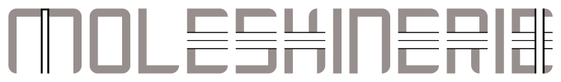
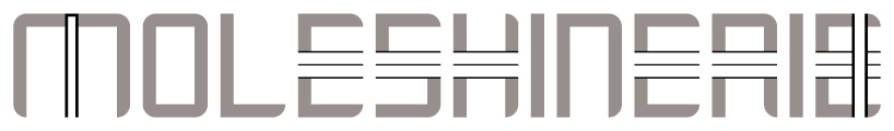
main: 2 colors
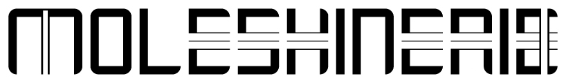
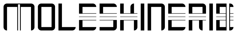 main: monochrome
 main: no strips
 alternative of K and R: 2 colors
 alternative of K and R: monochrome
 symbol: ME
shortlisted entries (2162)