The Link by Joyce Kwong from china
designer's own words:
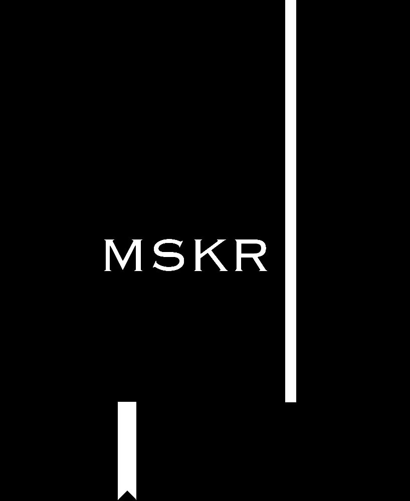
our design revolves around the idea of the link between moleskine and its users. our first design (the classic) has the symbolic strip at the far right and left bottom of moleskine illustrates the basic yet forever in style outline of moleskine notebooks;a combination of classic and style while displaying the most significant details of molskinerie. by showing "moleskinerie" through "mskr" represented our love of the simplicity and unique character of moleskinerie;and we also kept the font of original moleskine as to show the indestructable connection between "traditional moleskine" and "cutting-edge molskinerie",no matter how far time goes.
our second design (the collaboration)has the realistic image of the hand that illustrates the artists's participation in building the modern molskinerie,and through the contemporary digital font of the word "moleskine" in this design and the contrast with the physically realistic image of the hand,the intimate relationship and secure bonding between the user and moleskinerie is perfectly displayed and valued. our last design, the third design (the combination)has the traditional easily recognized moleskine logo, and we added "-rie" at the end to show how the brand new molskinerie is tightly linked with the original brand moleskine,and how molskinerie is a part of original molskine but also has its own distinctive character devised from the different variations of love from molskine users.the idea of vibrant colors came from the different types of users around the world that uses molskine notebooks,and while moleskine provides the actual notebooks, molskinerie receives feedback of the users.
The Classic
![]() The Collaboration
The Collaboration
 The Combination