Eppur si muove! by miha kosmac from slovenia
designer's own words:
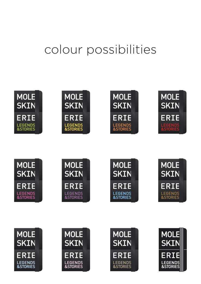
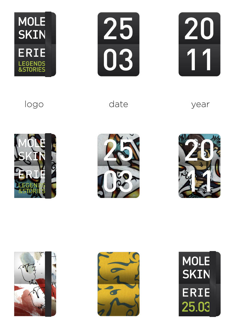
the idea behind this logo was the fact many people use moleskine products to plan their lives down to the last minute. from this fact emerged the idea of this terminal clock used on airports to guide us and help us. for business people that means a schedule, for the designers moleskine has become much more than just a notebook. the moleskine notebook has a certain status among the young people, who use it to share their ideas and art with others alike. so much different ideas but always the same one notebook. moleskine notebook. moleskine gives the artists a blank platform for them to fill it up with endless amount of ideas and stories. this is exactly what my logo is about, a strict notebook that can be filled with many interesting ideas. the logo can be used statically but really works well dynamically. the pages of the notebook-clock turn, so filling the logo with new and different illustrations or pictures. in a sense it can be used for whichever information is the most important on that day. an important factor visually for me was the similarity between the well known moleskine silhouette and well known shape of the terminal clock. logotype works without the slogan also, the date replaces the slogan in that case (look logo variations)
Basic logo forms
 Colour diveristy
 Logo variations
 Kinetic logo
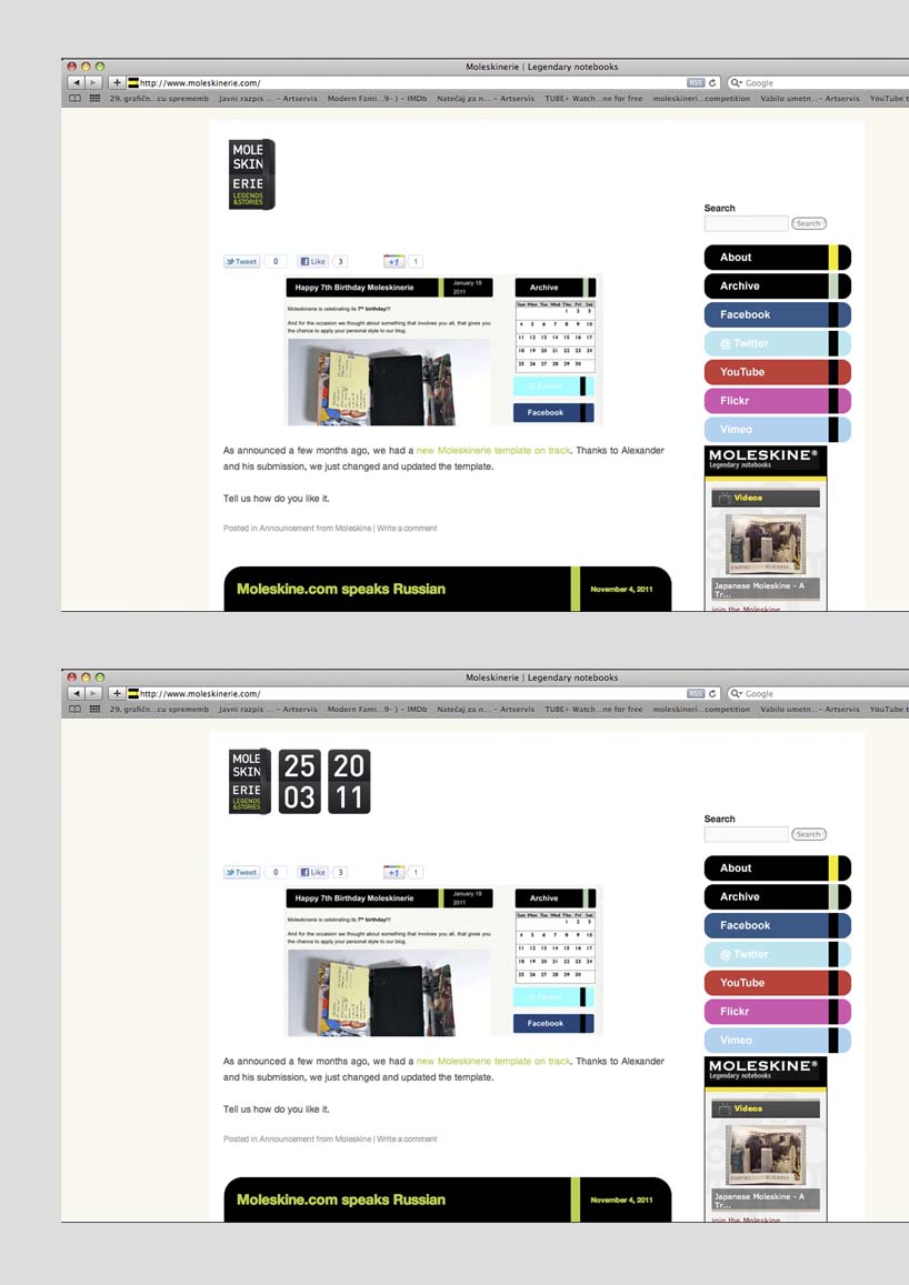
 Web use
 Logo application