m2 > my moleskine by sandra maria teixeira from portugal
designer's own words:
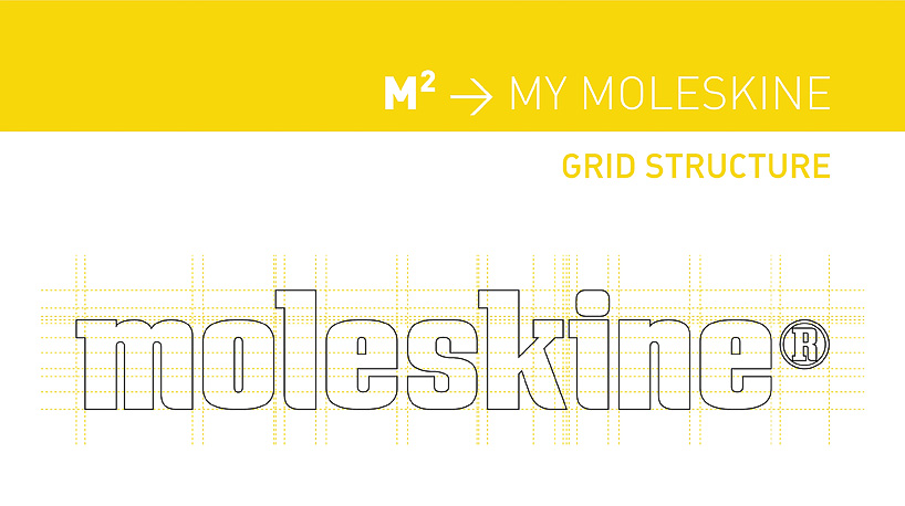
the logo "m2 > my moleskine" has as primary focus the strength of a brand that has remainedtrue to itself.
this solidity is reflected in sans serif characters with carefully designed software vector.
the original design of the characters through their stylized framework provides excellent legibility and adaptability to all printing processes and bas-relief.
"m2 > my moleskine" is intended to give meaning and contemporaneity through a logo with a unique structure and self-assured.
the old logo, created through the characters in the font "copperplate gothic" to be replaced by this "m2 > my moleskine" recovers the energy required to communicate effectively and get a newgraphic identity, marked by confident and structuring lines designed millimetrically.
the icon of "m2 > my moleskine" emphasizes the famous rubber band that involves the classic books.
![]()
![]()