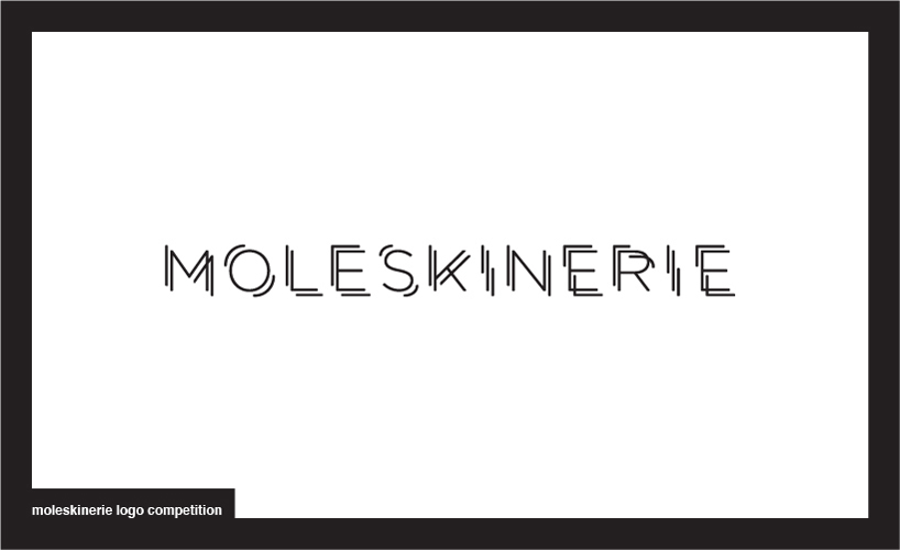
sketching by Dario Volpe from italy
designer's own words:
the idea for this logo comes from the will to express with the word “moleskinerie” the universe formed by people who use moleskine’s notebooks. the logo can have two interpretations, the first one is given by the vision of the reduced logo, creating a trembling effect, simulating handwriting; the second, with an overview of the letters’ details it can be noticed how each of these can represent various concepts such as movement, planning, design, creativity, in a game of makeup and break down.
mark
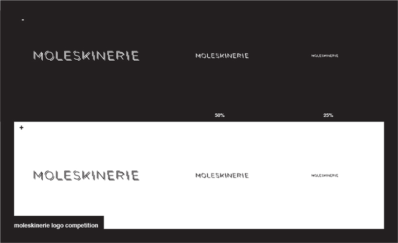 reduction
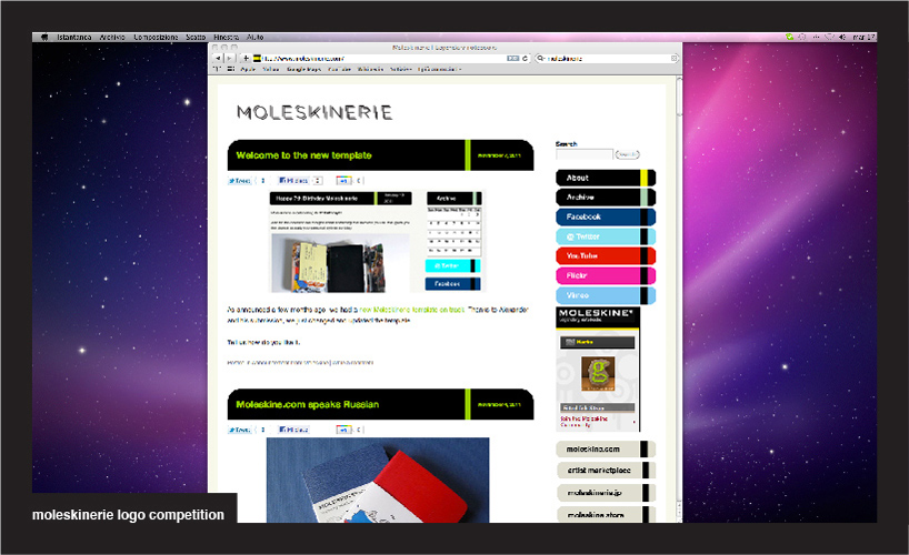 application to the blog
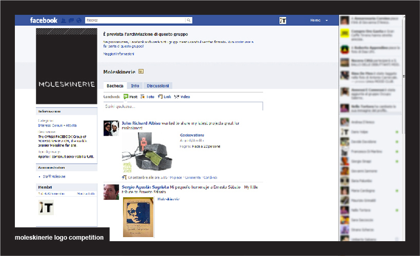 application to facebook
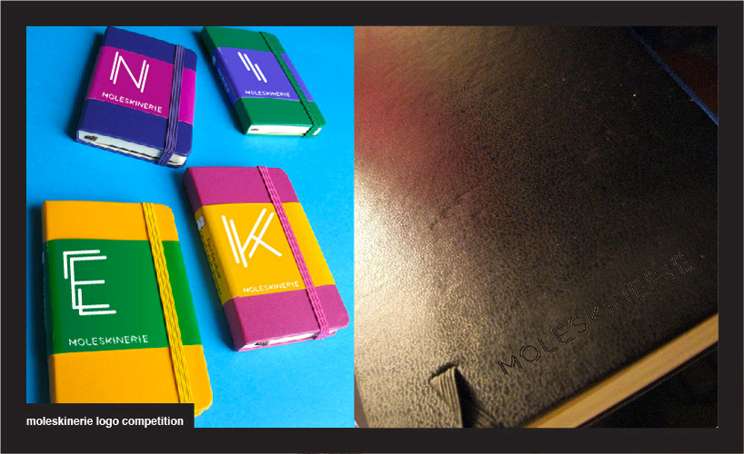 application, logo imprinted
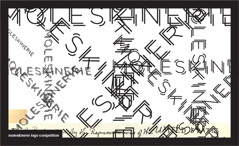 application
shortlisted entries (2162)