the people moleskinerie by boon tan from australia
designer's own words:
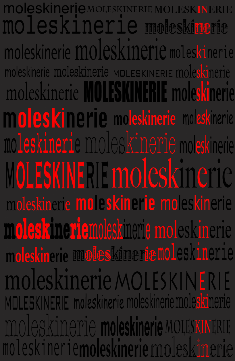
the icon of moleskine is the classic notebook itself. There for i use lots of "moleskinerie" to draw the cover of the notebook as the logo of moleskine.
all the moleskinerie fonts are different. I got this inspiration from a phrase i google from wiki "moleskine does not have
an official pronunciation as it is a brand name with undefined national identity"
therefor i use different text to represent different character group of people
scribble text represent people who need to take notes all the time at anywhere such like reporter or writer, bold text for people
write down their schedule, artistic text for the artist to draw their imagination, freeform text for people to make down their dairy life.
different people from different professional field will have different perspective for "moleskine" notebook. but from their heart they all know if
they need a "moleskine" note book. So at the center of logo you can find a red color "M" . The red line on right side of the logo represent the elastic ban of the notebook.
thats my design for logo Moleskine.