Drop by mar horrach from spain
designer's own words:
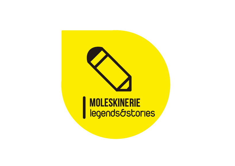
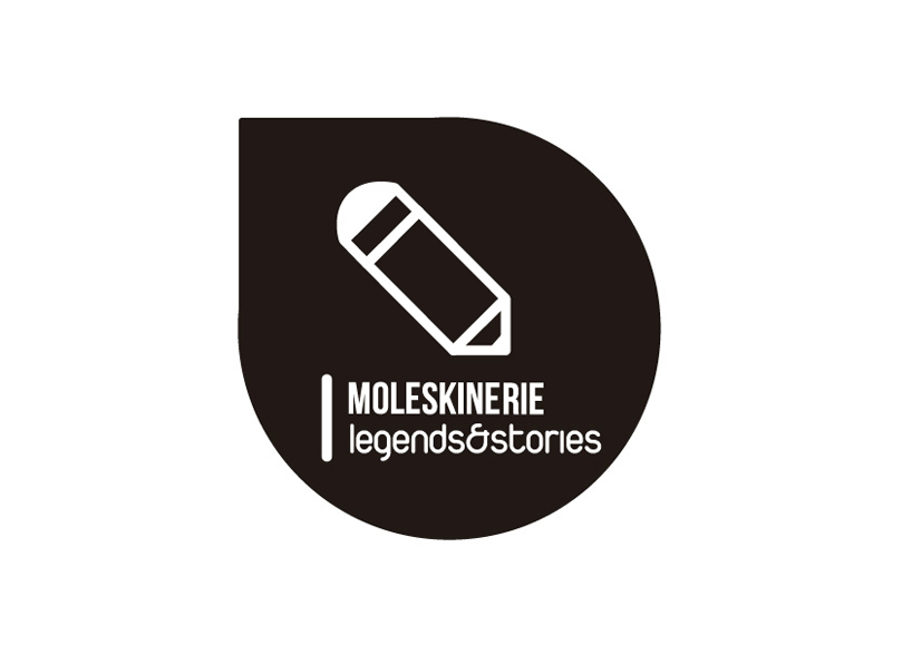
prior to the creative process, there was a key stage in the development of the project: we focus on brand awareness for which we work. we investigated about their positioning in the market, its target audience, which are its objectives and how they wish to be perceived through its identity. the logo consists of two lines of text which lies in the variation hierarchy typography. the word Moleskinerie is the essence of the logo and typography supports robust and noble evergreen as well as legendary character. as a subscript, 'legends & stories' is written with a fresh and current source, based not so much the nature of branding itself as the means of insertion of the logo: the network.
in the first proposal presented typographic composition embedded in a drop-shaped geometry. moreover, the text is accompanied by iconographic reproduction of a pencil. the final composition is intended to define creativity and imagination (represented by the drop) as the essence of the value of products moleskine. the pen is presented as a tool through which that creativity exercised and embodied. it symbolizes the element or elements through which we access to a unique inner world, guarded, give back more than ten years, moleskine notebooks and diaries.
finally, note that the choice of the color palette or respond to a random decision. through the use of bright colors is intended to convey the originality and uniqueness of the brand, its chameleon nomadism, their own identity as a unique, extraordinary and irrepetible.