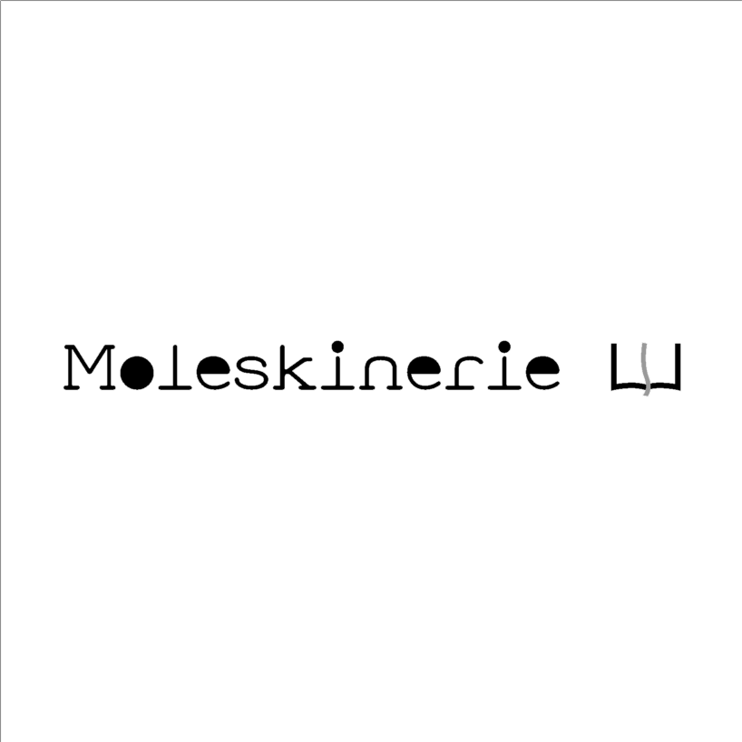
MymO by miriam chtioui from italy
designer's own words:
The focus of this Moleskinerie logo purpose is immediacy and reproducibility, as requested by the competition. Moleskine notebook survives time and fashions as a symbol which encompasses both contemporaneity, with its colourful, appealing design, and tradition, by preserving writing. As a proof of its everlasting quality the most famous post artists have collected dozen of these pocket notebooks. Based on these ideas, the design logo creation developed spontaneously. The lettering appears both mild and rigorous. Its classical style has been revesited in modern as full voyles and round corners. The adopted technique marks the aim of simplicity of the work through the traits immediacy and the limited use of right angles. The structure of the logo is composed of a text and a graphic symbol also. This symbol represents a moleskine notebook with a bookmark. The graphic symbol looks stereotyped in order to remain engraved on the audience mind. COLOURS
YELLOW R240 G237 B0
BLUE R160 G168 B240
GREEN R152 G205 B53
RED R233 G74 B94
logo scale 1_1 positive
 logo scale 1_1 negative
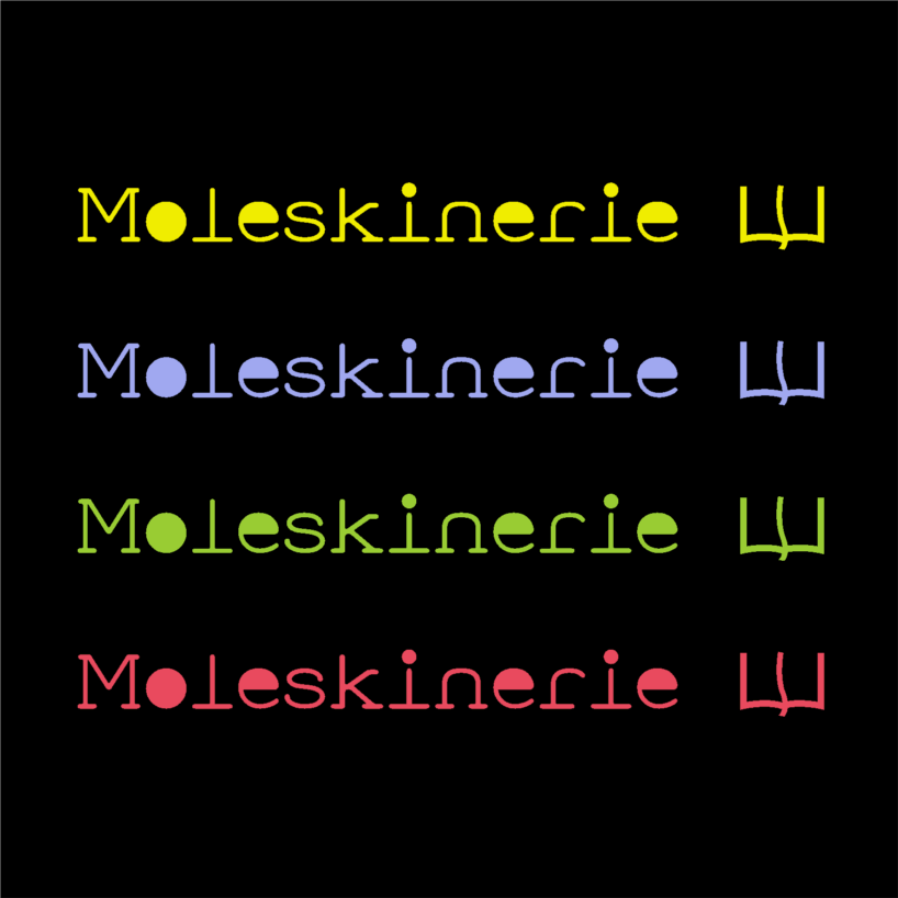 logo scale 1_1 colour
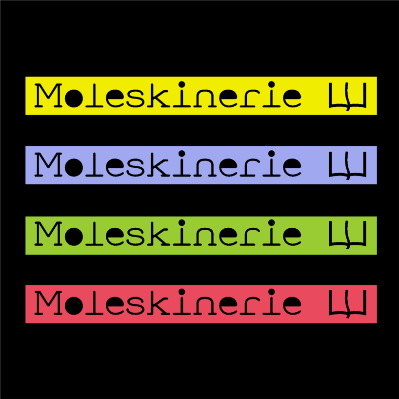 logo scale 1_1 colour negative
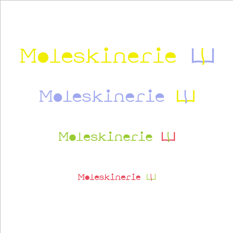 logo scale reductions_positive
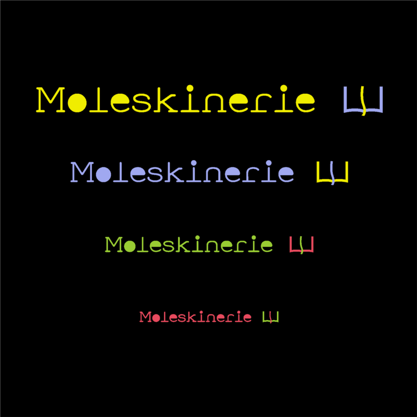 logo scale reductions_ negative