
tree section by nicola-matteo munari from italy
designer's own words:
the idea of legendary journey has always been the core of moleskine.
as each journey has its own story so a section of a tree trunk reveals the map of a potentially endless story, from the origins to the present.
a logo, even if visually simple, should not always be obvious and, as in this case, may conduct the viewer into an exploration that will lead him to discover the essence of the moleskine experience: the paper origin, the manual skill and the craftsmanship quality.
moleskinerie continues this journey tracing new circles in the trunk of his story…
the logo is combined with a strong but neutral typefaces which reinforces the idea of tree trunk and the idea of origin: the neue haas grotesk.
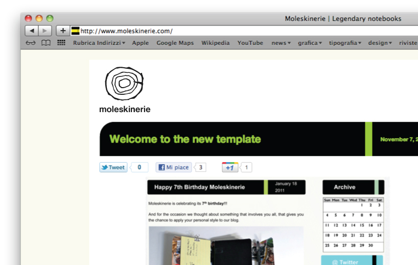 the application of the logo in moleskinerie homepage.
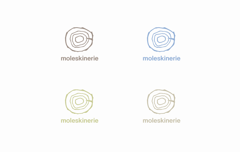 some chromatic variations which reflects the ideas of earth, air and water, nature and paper.
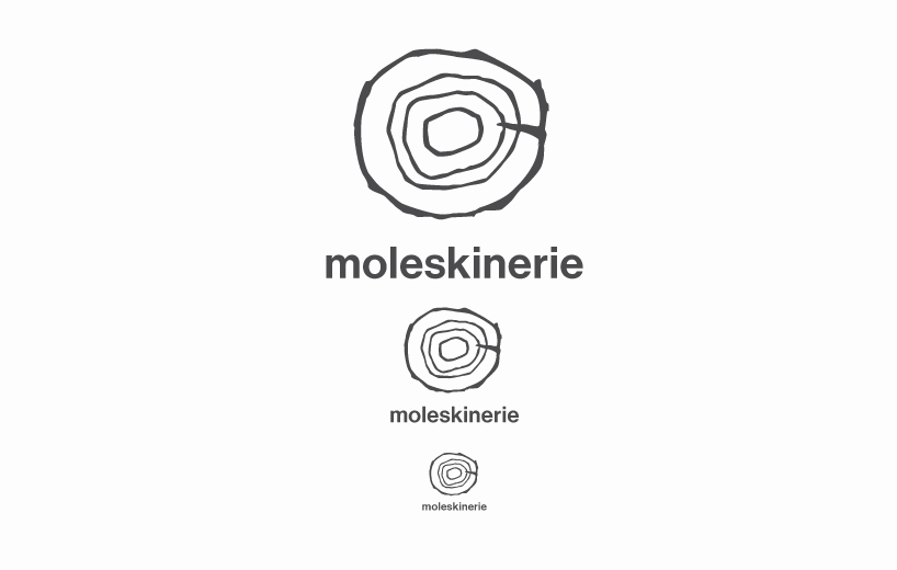 the functioning of the logo in large, medium and very small dimensions.
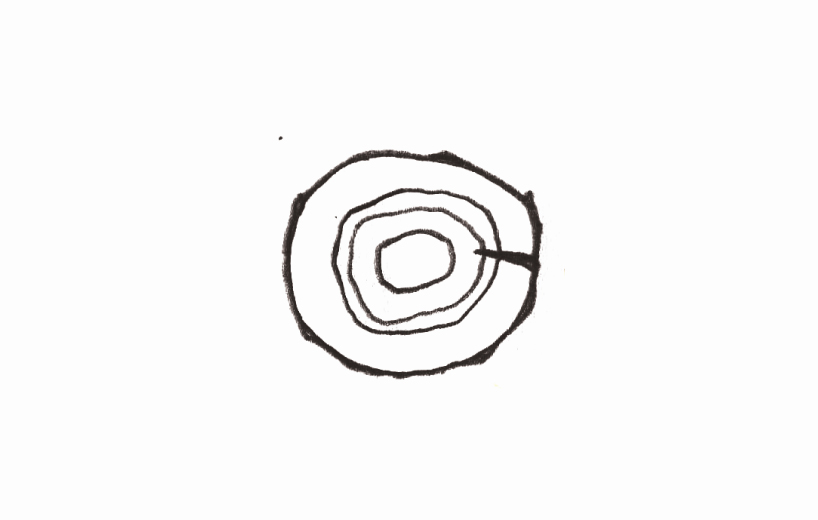 the hand drawing used as starting point.
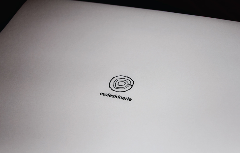 a printed example of the logo.