M for moleskinerie by Niccolò Franceschini from italy
designer's own words:
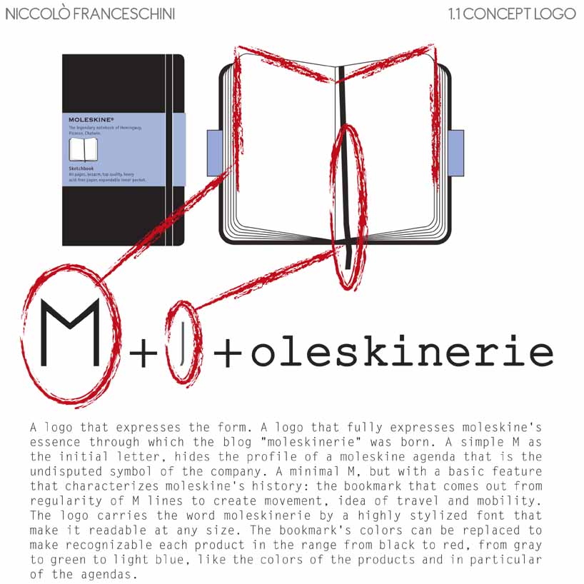
a logo that expresses the form. a logo that fully expresses moleskine's essence through which the blog "moleskinerie" was born. a simple m as the initial letter, hides the profile of a moleskine agenda that is the undisputed symbol of the company. a minimal m, but with a basic feature that characterizes moleskine's history: the bookmark that comes out from regularity of m lines to create movement, idea of travel and mobility. the logo carries the word moleskinerie by a highly stylized font that make it readable at any size. the bookmark's colors can be replaced to make recognizable each product in the range from black to red, from gray to green to light blue, like the colors of the products and in particular of the agendas.
Concept
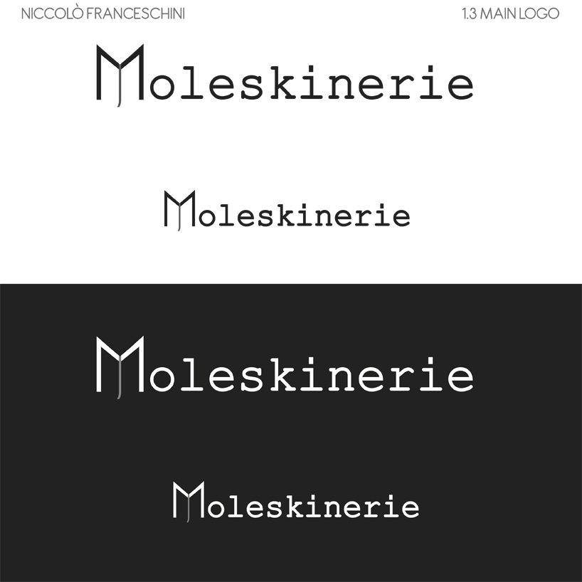 Main Colour
 One Colour
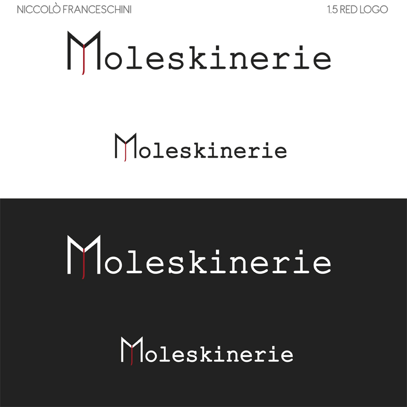 Red Logo
 Change Colour
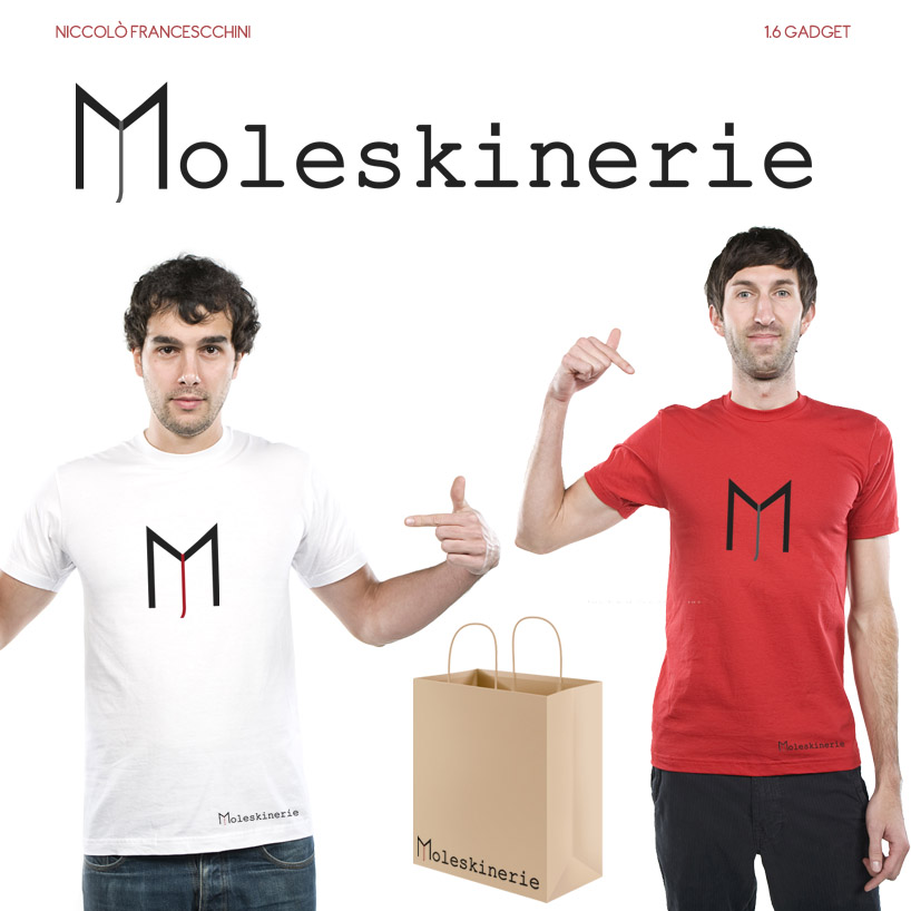 Gadget