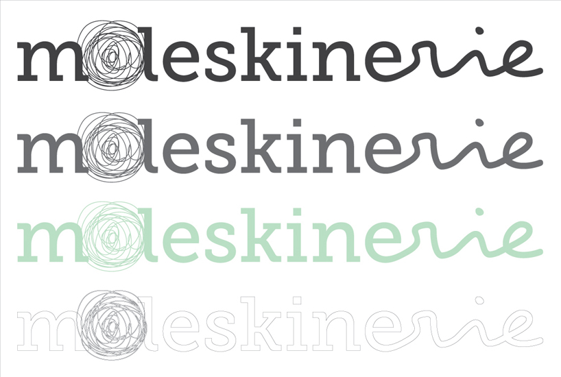
moleskinerie logo by regina vergara from mexico
designer's own words:
this logo reflects what moleskine gives to me on a daily basis, and what i’m sure it gives to everyone else who owns one:
moleskine – serif font, not too playful, equivalent to serious brainstorming, grocery list, or hateful letter to the ex-boyfriend
o – this circular (o-like) sketch gives a sense of writing, could be a pencil, pen, lipstick, crayon, even charcoal (we don’t judge, it’s your notebook)
rie – the creative twist of a thought (in this case a word), the equivalent to a cool doodle you just happened to do unexpectedly. this is where you let go, and let the ideas flow
why the color?
keeping it neutral, soothing, but strong and combined. not to aggressive for the eye but still, good contrast.
hope you like it
logo
 logo apps/colors
shortlisted entries (2162)