your moleskine notebook speaks by jason lee from china
designer's own words:
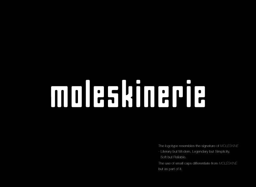
the logotype resembles the signature of moleskine - literary but modern, legendary but simplicity, soft but reliable. which the inspiration come from 2 elements: moleskine notebook itself and the shelf of moleskine notebook in stores.
the letter form comes from the gesture of moleskine notebook: clean, rectangular, cut edges and appropriate thickness. these form the structure of the letter and resembles the sense of the spines of notebooks.
as the structure of the letters resemble moleskine notebooks(book spines), the logotype displays like a incomplete shelf which voids between letters. Like a shelf waiting to be filled up. Similar to an online platform, waiting for responds.
the use of small caps differentiate from moleskine but as part of it. also moleskinerie logotype is simple, as it is a companion to respondant to outstand thier workpeices, not overcome.
the logotype can be applied on different situations and colour can be various as long as the colours match moleskine products and themes.
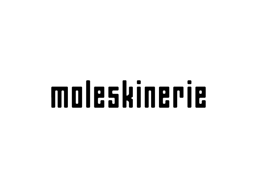
moleskinerie in black
 moleskinerie in white
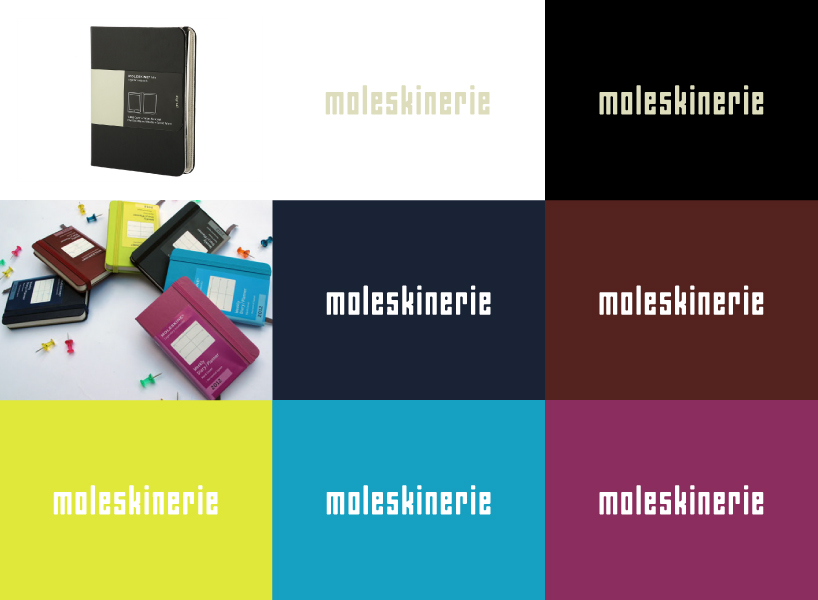 moleskinerie in colour
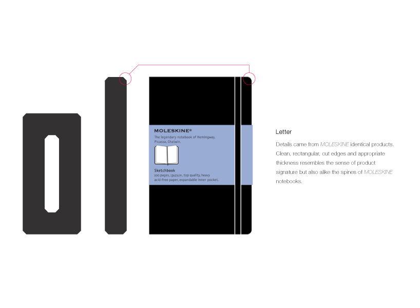 letter
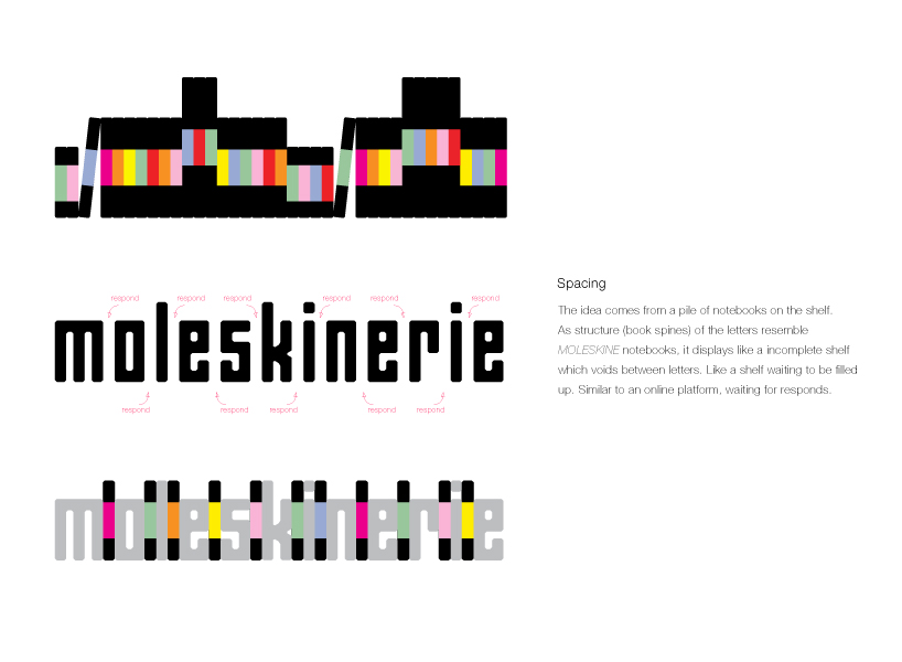 spacing
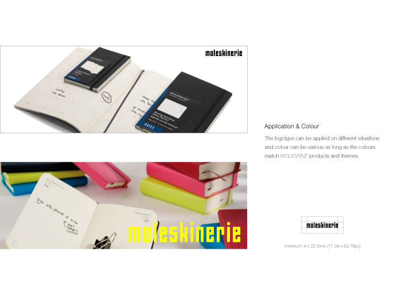 application