MODERNclassic by borja ruiz-apilánez from spain
designer's own words:
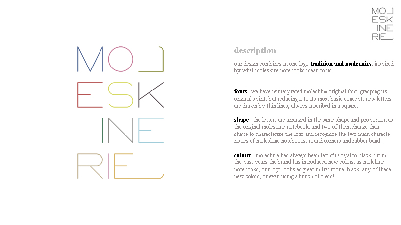
our design combines in one logo tradition and modernity, inspired by what moleskine notebooks mean to us.
>fonts
we have reinterpreted moleskine original font, grasping its original spirit, but reducing it to its most basic concept, new letters are drawn by thin lines, always inscribed in a square.
>shape
the letters are arranged in the same shape and proportion as the original moleskine notebook, and two of them change their shape to characterize the logo and recognize the two main characteristics of moleskine notebooks: round corners and rubber band.
>colour
moleskine has always been faithful/loyal to black but in the past years the brand has introduced new colors. as molekine notebooks, our logo looks as great in traditional black, any of these new colors, or even using a bunch of them!
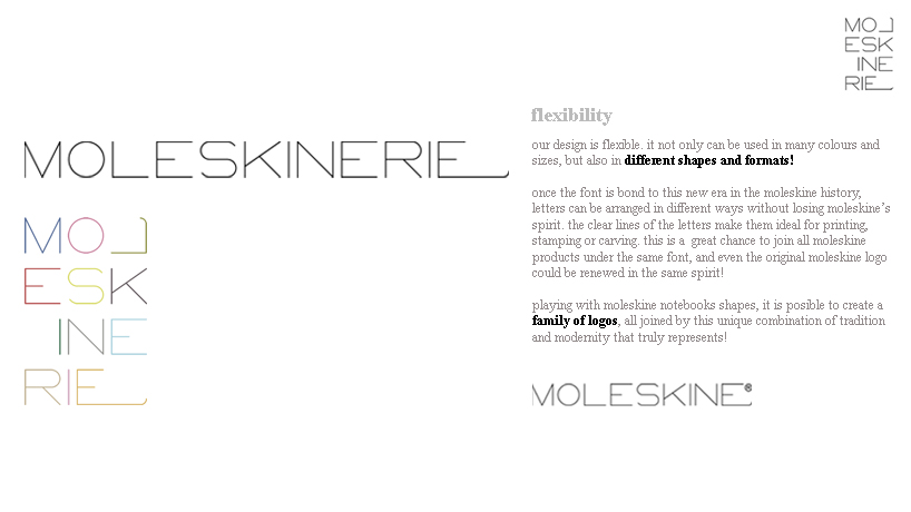
>flexibility
our design is flexible. it not only can be used in many colours and sizes, but also in different shapes and formats!
once the font is bond to this new era in the moleskine history, letters can be arranged in different ways without losing moleskine’s spirit. the clear lines of the letters make them ideal for printing, stamping or carving. this is a great chance to join all moleskine products under the same font, and even the original moleskine logo could be renewed in the same spirit!
playing with moleskine notebooks shapes, it is posible to create a family of logos, all joined by this unique combination of tradition and modernity that truly represents!
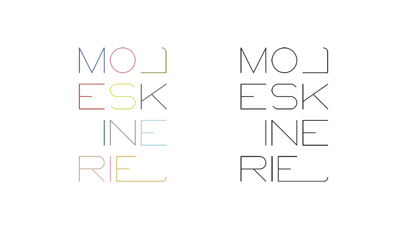
LOGO colour / b&w
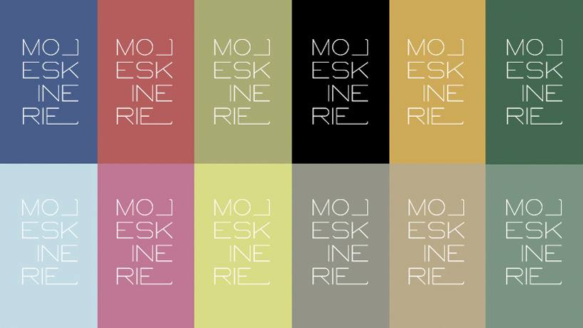 LOGO multicolour negative
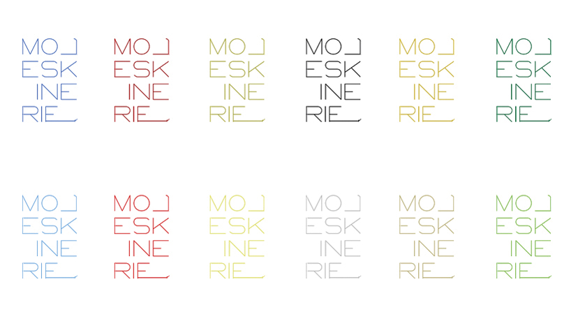 LOGO multicolour possitive
 LOGO description
 LOGO possibilities