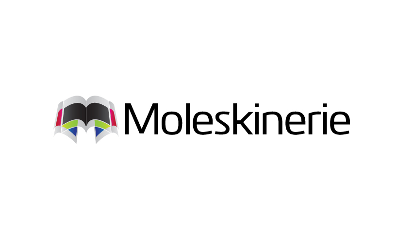
moleskinerie logo 1 twirling "m" by milan krstevski from macedonia
designer's own words:
concept for this logo is simple: pages.
both paper or virtual, we all share our everyday experiences and/or plan our schedule by writing or typing on/in them.
the logo is made out of pages that resemble the look of both printed pages and digital ones (articles on web/blogs). they twirl around each other, forming the letter "m".
no matter if you are looking just at the outline, or at the colored areas, or at the negative space on the bottom of the logo, the letter "m"is right there in front of you.
color version has the colors that are part of moleskinerie's blog color scheme, and colors that are part of moleskine's product designs.
logo can also be used in single color only, either on light or dark background, as it's shown in the preview.
logo in full color
 black on white version
 white on black version