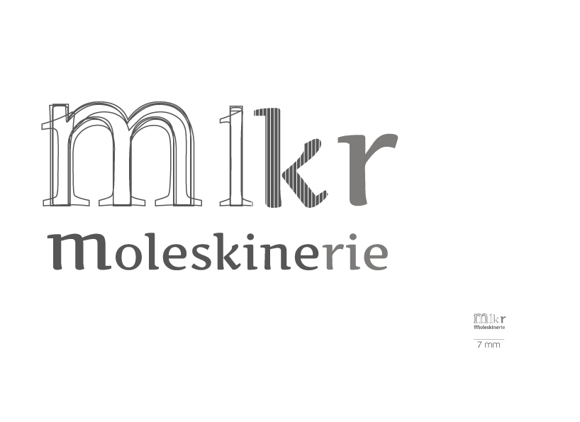
MOLESKENERIE LOGO by vanda Seixas seixas from portugal
designer's own words:
The concept of the logo is the evolution from a sketch or from a project, which always starts from a concept, followed by lines, basic graphics, it starts to take the shape of a complex project and after, the final work. The connection of the project and the evolution comes from the utilization of the own moleskine which is a tool and mean of sketching, writing or organizing projects etc.
A simple logo, has an easy to identify concept and good use at a web level, due to its font simplicity, on which it was worked. I’ve chosen a double face logo, with an acronym that refers to a sketch and the lettring beneath has a more objective element of identification.
shortlisted entries (2162)