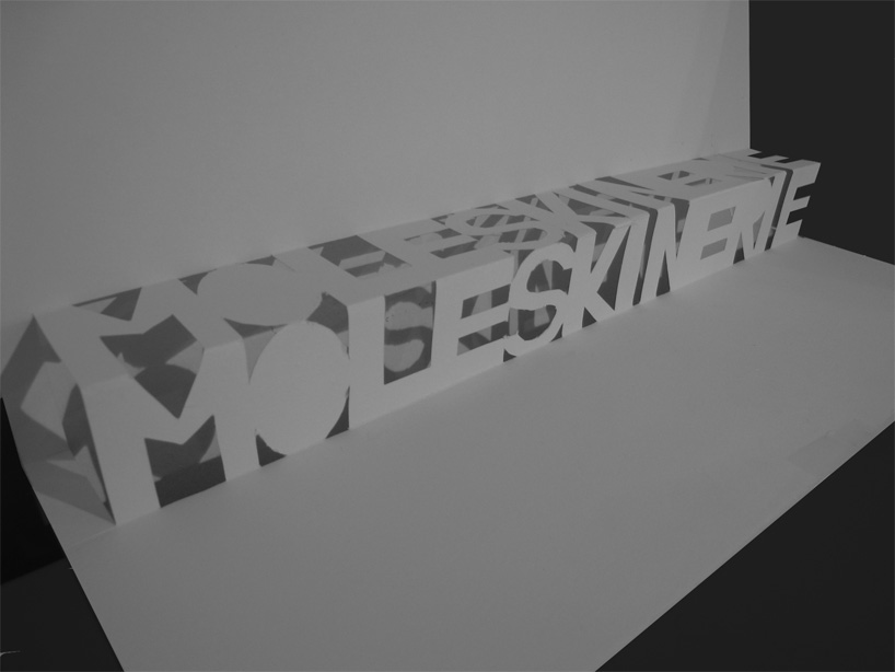
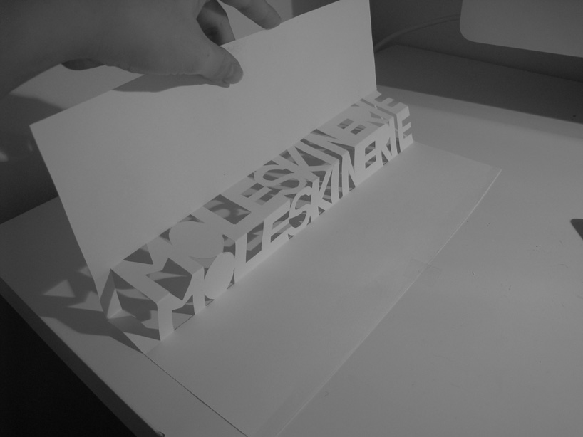
pop up moleskinerie by mei-lin fan from austria
designer's own words:
for me, moleskine always presented good taste and simplicity. the logo should be no different. and what better material to make the logo from than the very essential of moleskine - paper?
made with only one piece of paper and a scalpel.
a very simple, but still very effective logo that can be used in one or more colors.
logo
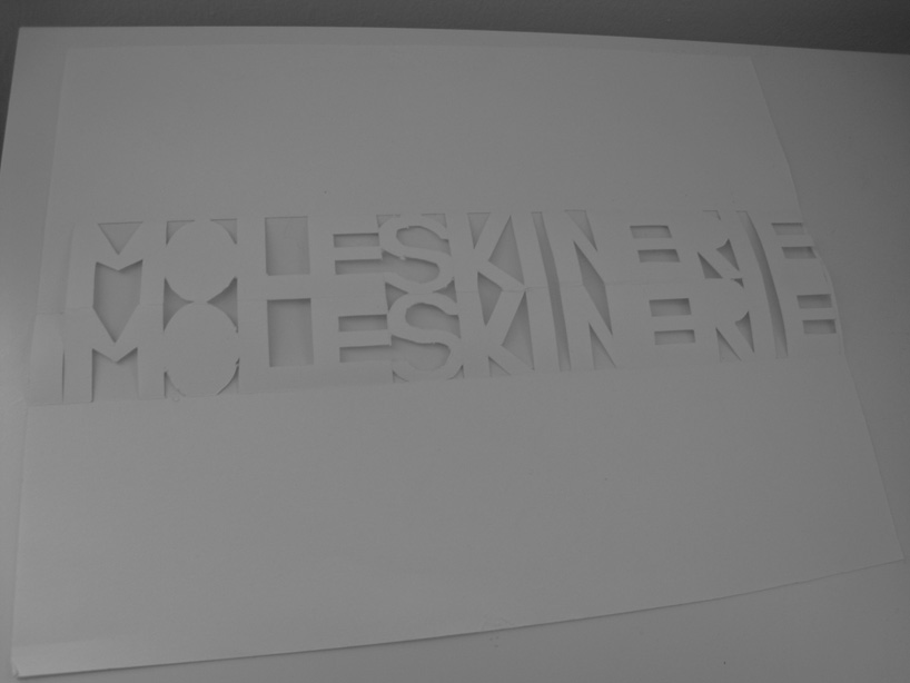 piece of paper
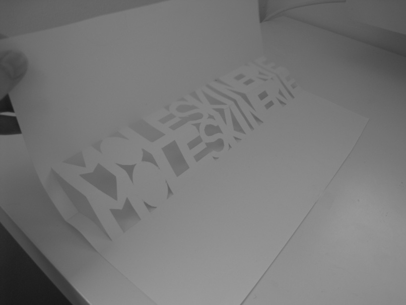 folding
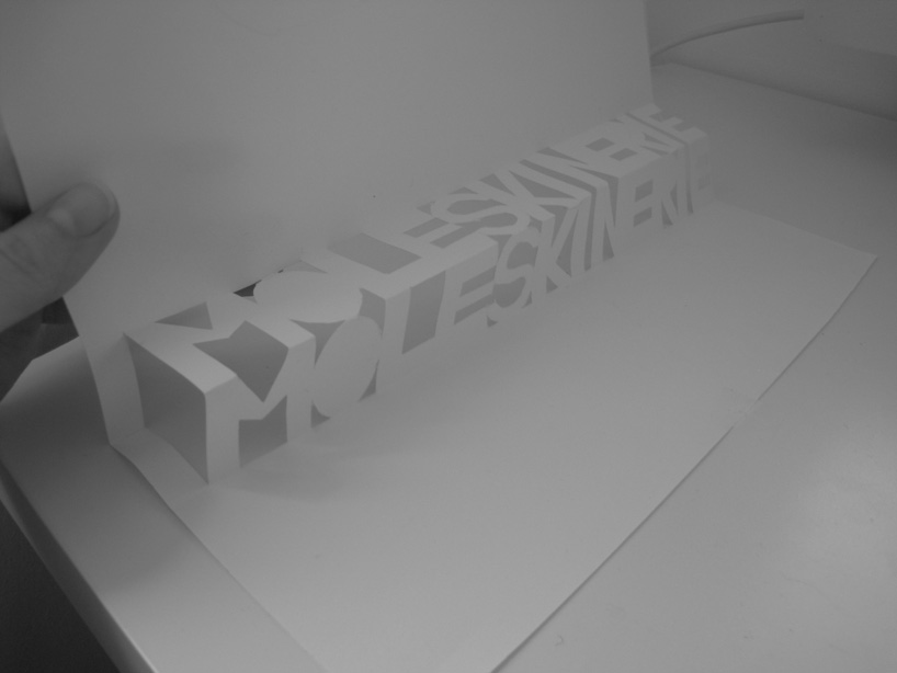 pop-up logo
 shadows
shortlisted entries (2162)