ideas in a moleskine shared in moleskinerie by joao miranda from portugal
designer's own words:
ideas in a moleskine shared in moleskinerie
i would say that moleskinerie is a depository where you share ideas, drawn/ wrote in your moleskine. and that's why my logo is base in a lamp shape (symbol of ideas) along with a pencil (the action) , all drawn together with the m (the identity), the main reference of the moleskine logo.
the moleskinerie typeface is a redesign of the moleskine copperplate. it is a simple stroke, just as you can have with a pencil, it is real clean and it brings the visual connection to the moleskine logo.
about the colours the passion red cliché is allied with a spark of yellow, mixing the feeling of energy and passion within what you carry in your moleskine.
Main Logo
 Vertical Logo
 Logo variations and minimum dimensions
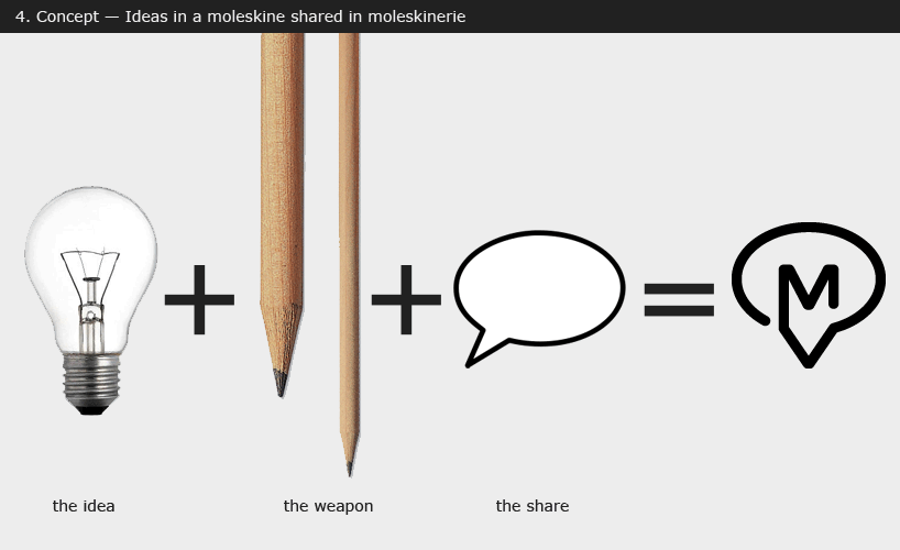 Concept
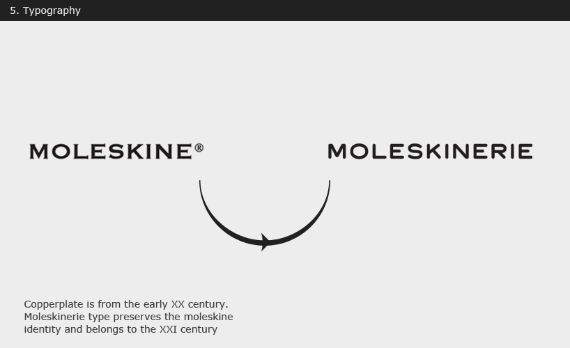 Typography