MRIE by ignacio ferrer pérez-blanco from spain
designer's own words:
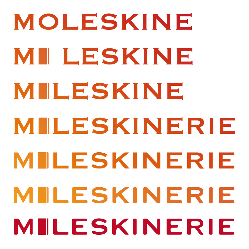
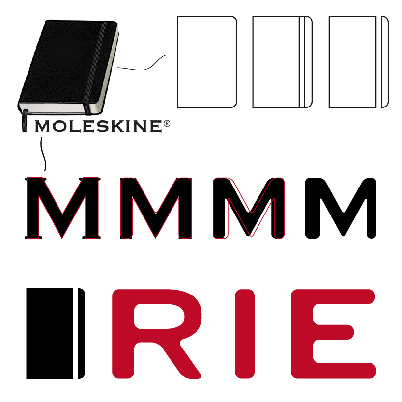
Moleskine has been since its creation a great provider of support, material support for people to focus on their content, being the details of its products the key of its success. For decades Moleskine has been loyal to those details, many of which form its identity. For this logo I wanted to include these and mix them in a fashion and aesthetic way, so the brand would be instantly recognizable, not just keeping the very core of its soul, but empowering it.
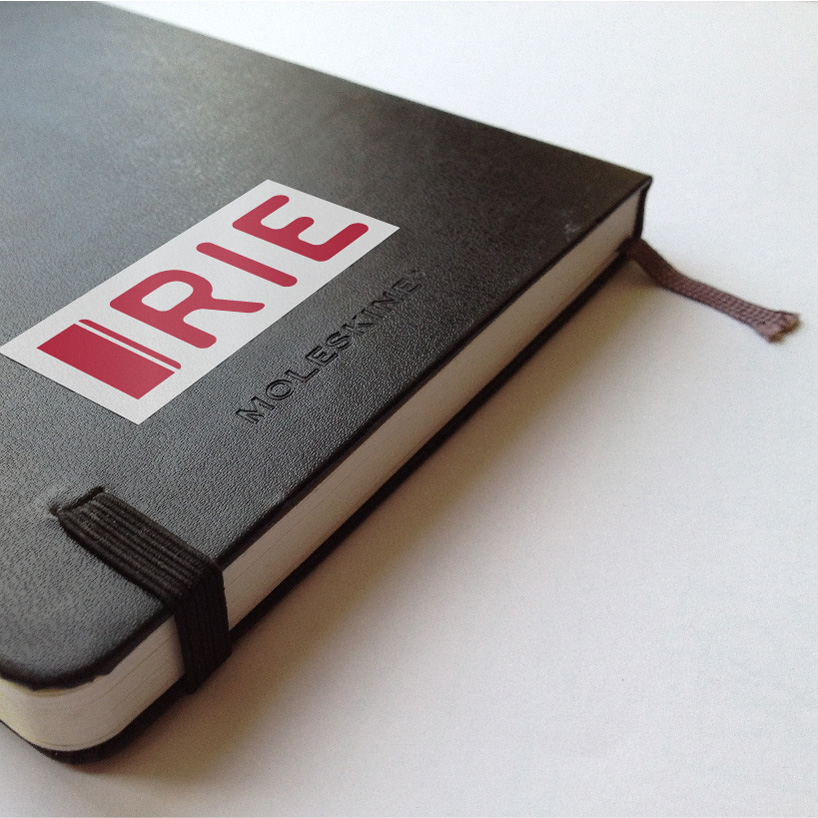
The first of this elements is the notebook itself, no matter the interior or format, a few elements remain the same, the rounded corners on the opening side and the elastic band to hold the notebook all together, the resultant simplified icon will, in a fraction of a second convey anyone that we are seeing a Moleskine or anything related to it.
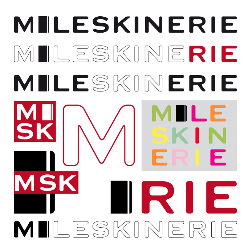
The second element is its typography, which as well has remain constant. In this case, just a couple of modifications have been made, giving as a result a totally refreshed one. Extracting the basic linework from the actual typography, rounded corners have substituted the static squared ones, the same way the rounded corners of the notebook show us that there's movement in there, inviting us to act an open the notebook. At last, every individual typo has been 'move' at its center towards the right, leaving a heaviest part at the left and consequently a thiner one at its right, this reinforces as well the dynamic style proposed, as MoleskineRIE is the place for those who travel, move, write and sketch everywhere, but more important, for those who share.
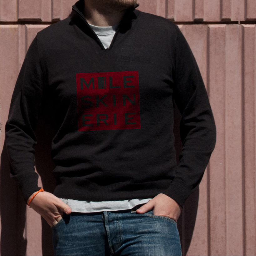
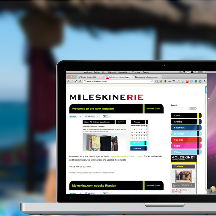
The final design is the result of this process, so rather of a static logo, it can be combined in multiple and infinite ways, so choose yours and join the community.
