spine changing logo : Moleskinerie_InfameStudio by santiago amaya from spain
designer's own words:
moleskinerie base concepts:
the basic idea of my proposal for the logo moleskinerie is to use of the famous shape of notebooks to obtain the logo. the pure typographic logo derive exactly from the spine of the notebook. emphasizing both the form and then the name through this typeface game. the main features are: the recognition, simplicity, usability and the possibility of reproduction in any medium: web and print.
readability:
the choice of using a condensed typography is because of the moleskinerie word length. being a long word and having to using it in a limited space in the blog, we found that proper choice. The use of Black is to give importance to the name and to look typography like moleskine book.
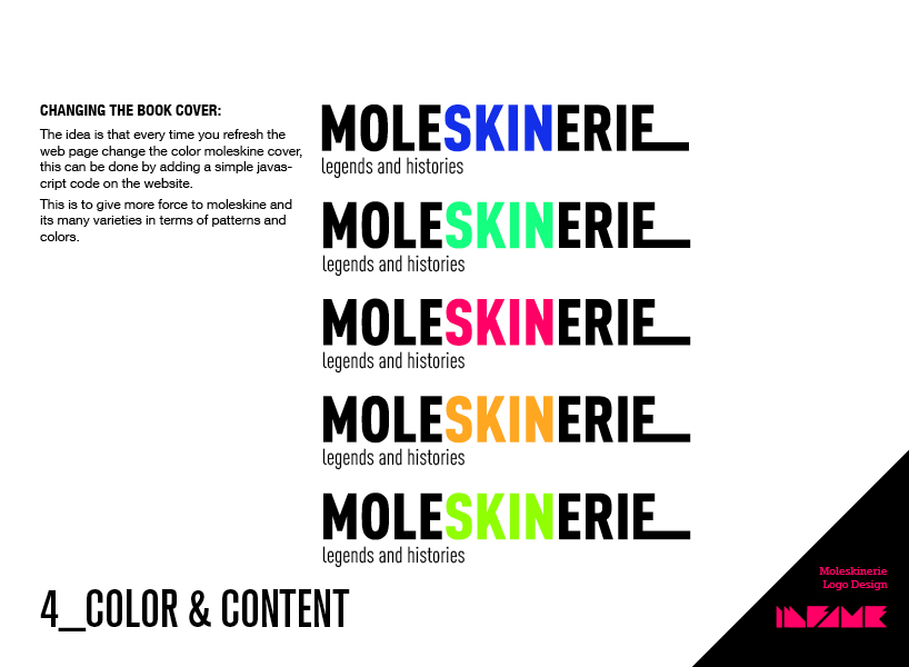
changing the book cover:
the idea is that every time you refresh the web page change the color moleskine cover, this can be done by adding a simple javascript code on the website. this is to give more force to moleskine and its many varieties in terms of patterns and colors.
logo
 concept
 features
 typeface
 color & content
 result