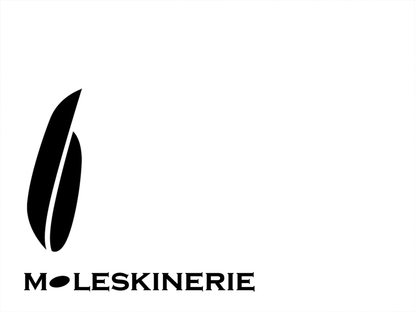
the quill by mahrenholz stefanie from germany
designer's own words:
the moleskinerie logo… pure, elegant, creative… inspired by moleskin.
introducing a “2nd label” with a new logo to a brand with a strong corporate identity, one has to find the fine line between overdoing it and doing to less.
the attached proposition leans on the existing logo of moleskine, but stands alone with a strong but simple symbol.
as moleskine’s image is always pure, natural and elegant, what would be a more suitable emblem for moleskinerie than the feather.
in combination with the well-known leathern material of moleskin, the feather seems to be the perfect match.
not only the feather but particularly the quill is a symbol of creation and creativity which interacts with the objects of the moleskine world and rounds it off to a coherent and conclusive image.
either the complete emblem with characters or the symbol of the feather on its own; either branded on leather or simply printed in black, the attached logo for moleskinerie takes effect in every size and multiple applications.

