moleskinerie + snake moleskinerie + man in black by marco lavagna from italy
designer's own words:
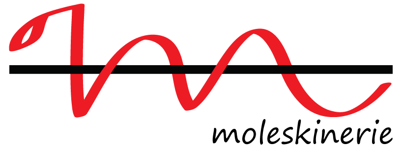
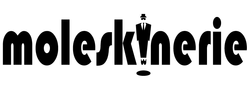
first idea (files 1 2 3) the first logo represents a stylized snake that creates the letter "m" initial of moleskinerie; the snake is wrapped around the famous black elastic closure. i chose the snake as a symbol of the city of milan, home to the manufacturing company, but also as a metaphor of the unknown and the mystery of the journey to unexplored places. the moleskinerie name is written using different types of fonts. - second idea (files 4 5 6) the second logo is a simple written “moleskinerie”. the moleskinerie name, written using different types of characters. In the second logo the letter “i” is replaced by the letter m written with the Webdings font. the letter m , written with the webdings font, is a man in black: the mysterious, interesting, elegant.
snake 1
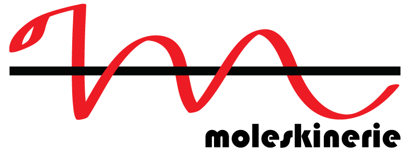 snake 2
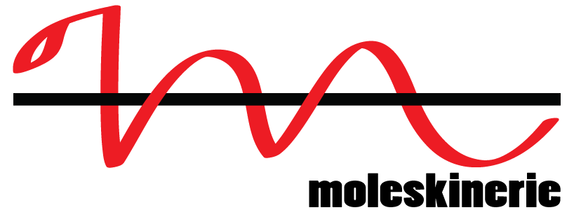 snake 3
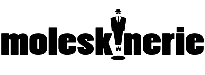 man in black 1
 man in black 2
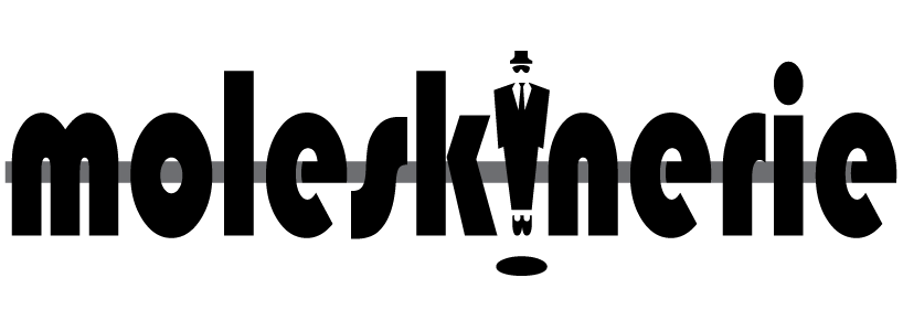 man in black 3 + line