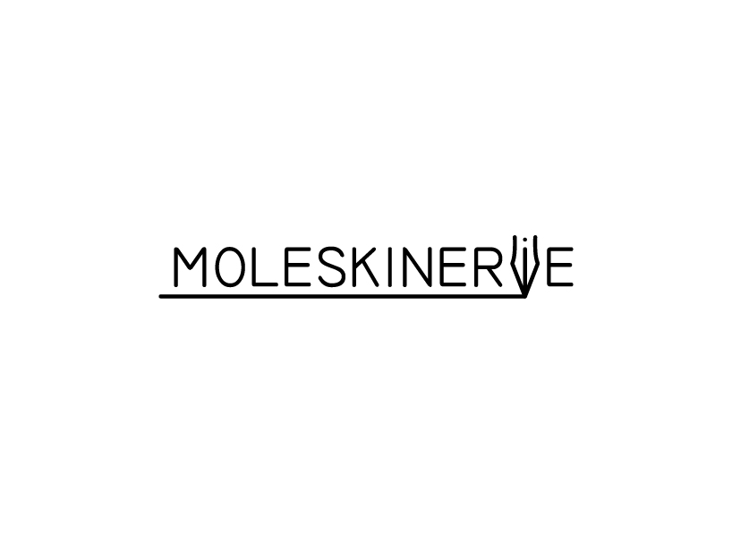
moleskinerie by e-ta-i haivri from poland
designer's own words:
being a moleskine user myself, there where a few elements i tried to consider while working on the design - things that i believe to be a part of the moleskine code, such as: useful, timeless, classic, stylish, elegant, handy, simple, quality, practical and not forgetting - black.
as the design of the moleskinerie logo is from the start representing the moleskine website and blog, i thought it would be good to fit it to the internet environment , but also make it possible to stand alone outside and if needed work with the moleskine logo itself.
the basic use of moleskine products requires the extension of the hand, better known as pencil or pen. i was looking for something that would represent both drawing and writing - and found out, that the one thing associated with both of them is the classic "nib" or "nib pen". though it might be the most common and obvious element to use, it also feels like the right one.
my aim was to make the logo light but classic and simple, and still representing both writing and drawing.
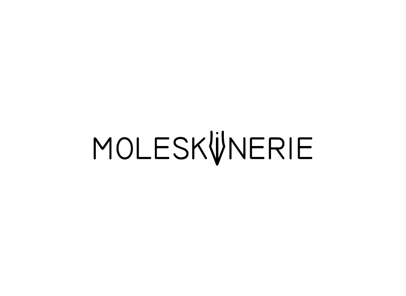
black, middle
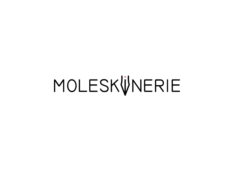 black, middle, red dot
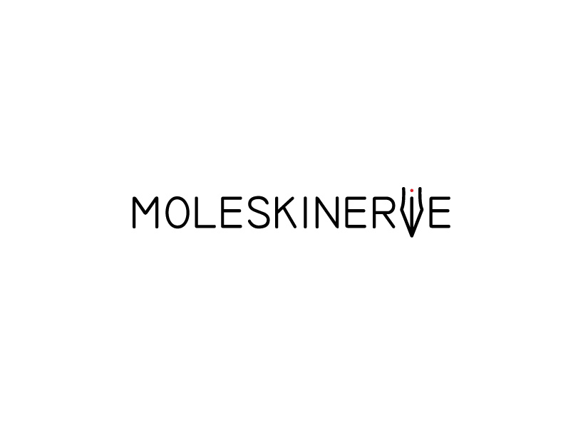 black, side, red dot
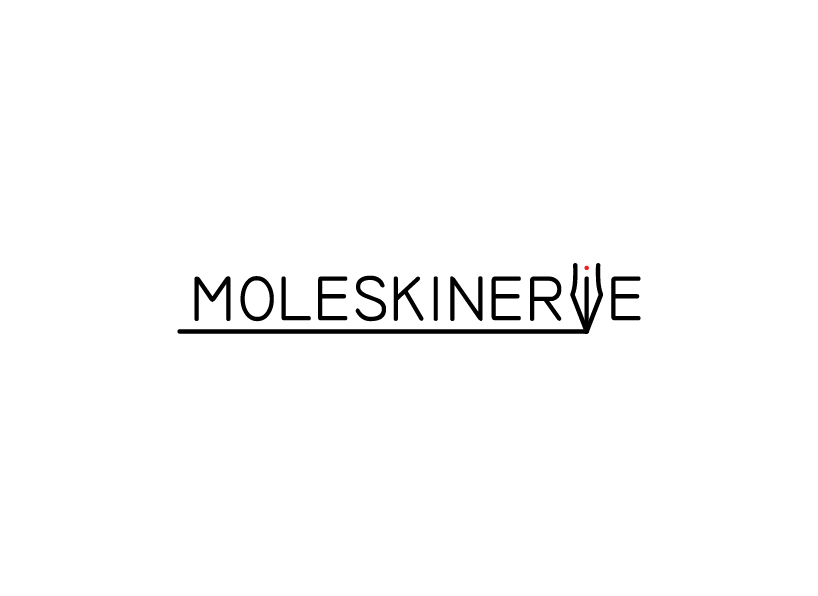 black, side, red dot, black line
 black, side, black line