RIBPEN by daan beugels from belgium
designer's own words:
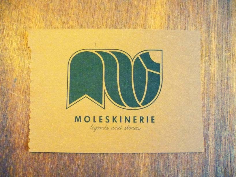
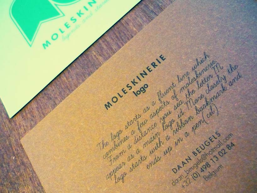
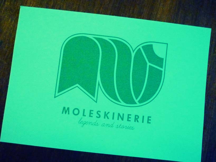
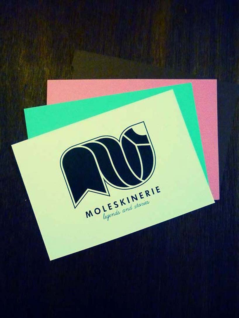
the logo starts as a fluent line which combines a few aspects of moleskinerie.
from a distance you sea the letter m appear as a main logo id. More closely the logo starts with a ribbon bookmark and ends up in a pen(cil).
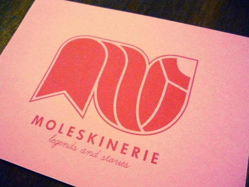
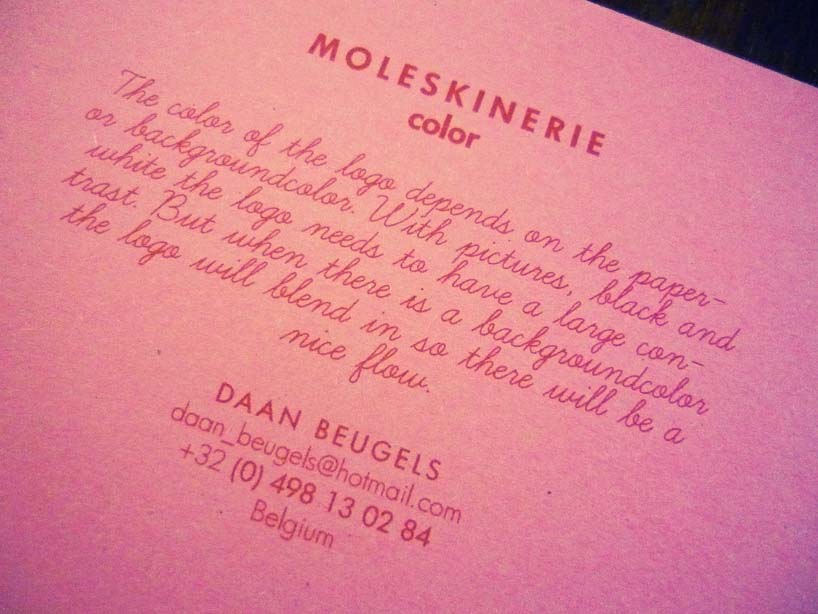
the color of the logo depends on the paper- or backgroundcolor. with pictures, black and white the logo needs to have a large contrast. but when there is a backgroundcolor the logo will blend in so there will be a nice flow.
shortlisted entries (2162)