moleskinerie by luca frasson from italy
designer's own words:
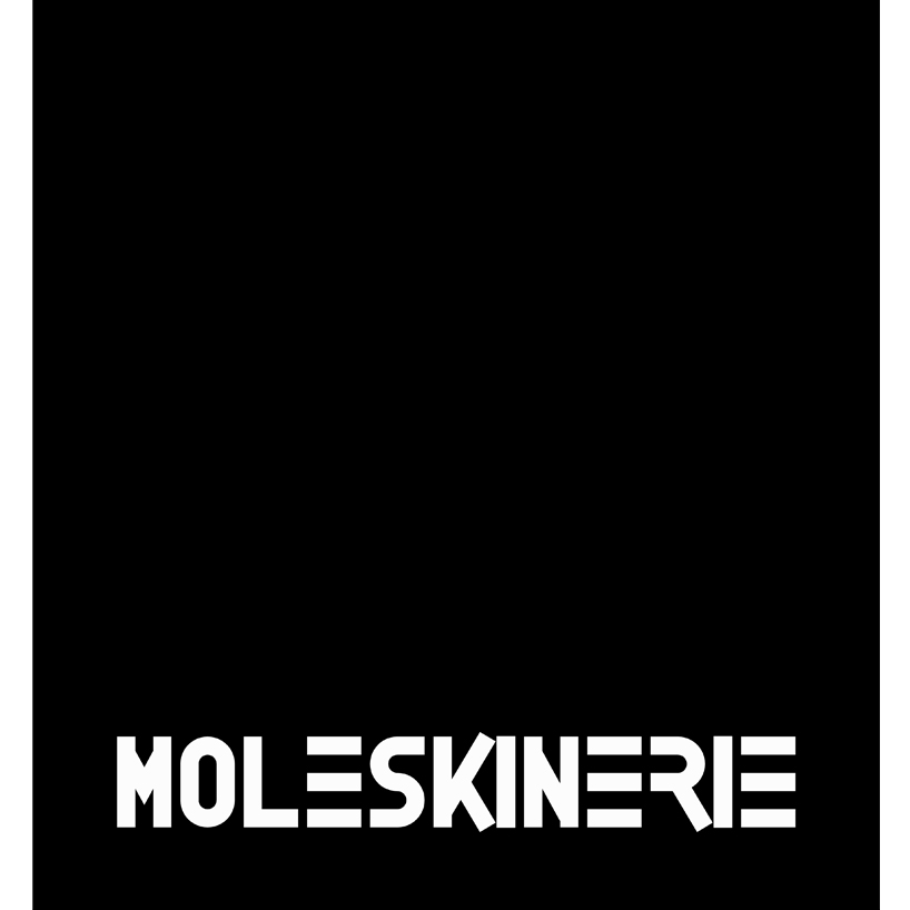
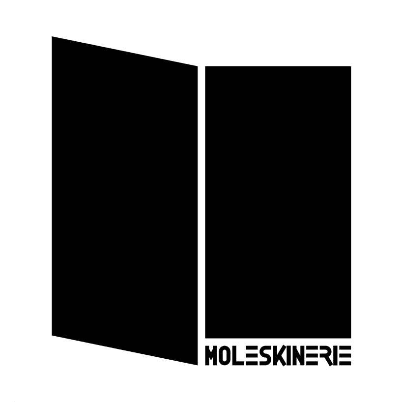
the logo created draws the shape of the black classic moleskine notebook recognized and loved around the world. it is so simple and essential to highlight its communicative function. the logo has a double meaning. the cover of the famous notebook is represented because it is a sign of strength of the brand moleskine. the notebook is open, to find the first free page on which to write, draw, or simply write down thoughts and ideas. in the reality in a moleskine notebook you can leave your own ideas, emotions, thoughts, so in the virtual reality, moleskinerie, as an open notebook, it's a space on which everyone can write, record, also create interaction and share, another concept that an open notebook can transmit. the logo consists of a graphic symbol and the word moleskinerie, in this way this can also be used independently. the font has been specially designed with a minimalist style, straight line, as the already well-known moleskine logo. at the same time,it have not to be a simple transposition on web, the moleskinerie logo has the same style but with a tone of modernity and technology.