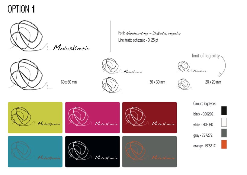
"simple creative complexity" by roberta campione from italy
designer's own words:
keywords and keyconcepts: freedom, casual order, art, graphic, involvement, focused and essential character, contrast.
the three versions have the same brand as the most suitable to represent the brand image and the official blog moleskine, and lines with different configurations, locations, and fonts. the goal was to create dynamism, harmony and studies of legibility with colors and sizes, by representing the graphic and creativity related to the moleskin world, with synthesis, art and purity. In the examples I tried to underline the contrast between the elements of my proposal: in the fist and second options there is an artistic line of the brand with a regular font of the word "moleskinerie", in the third one there is the opposite condition, regular line and sketched font.
option 01
 option 01_b
 option 02
 option 02_b
 option 03
 option 03_b