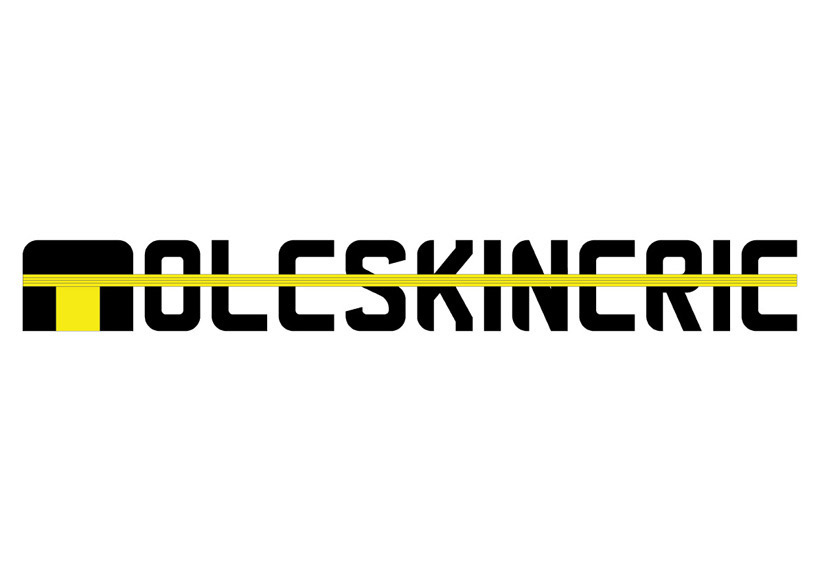
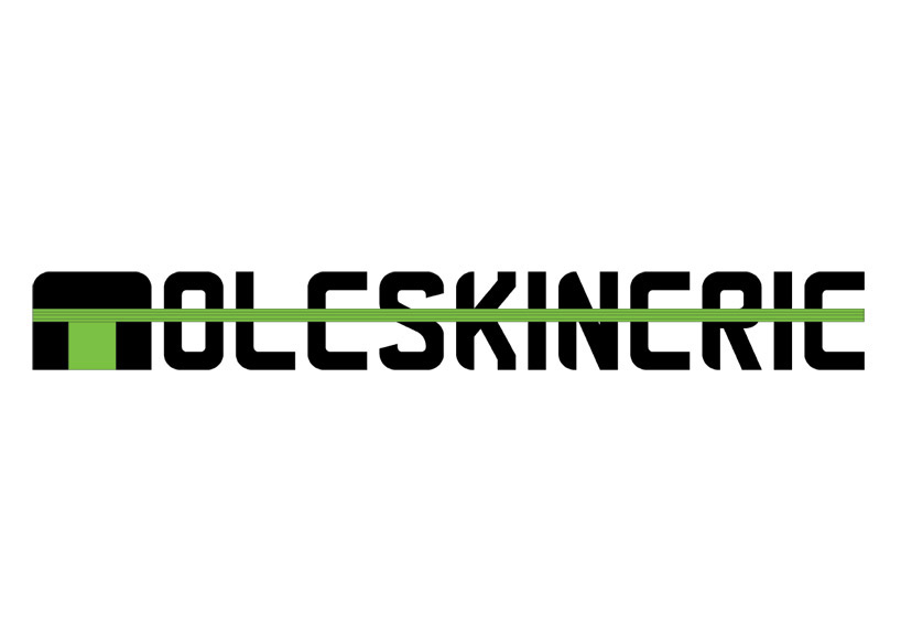
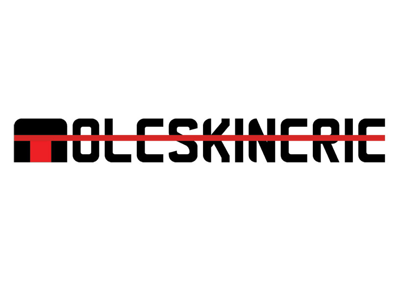
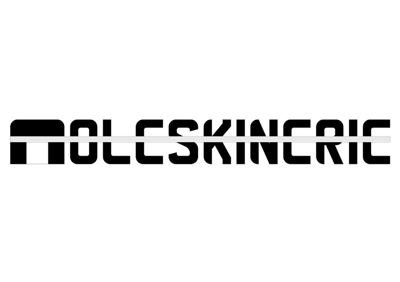
moleskinerie logo by erion dimushi from albania
designer's own words:
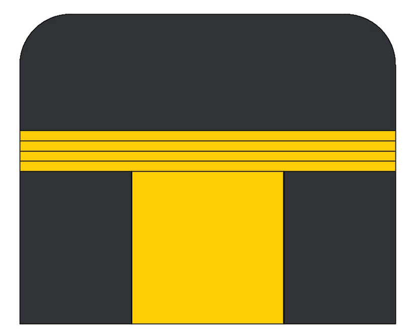
after a few trials i realize that the best way to design the molestinerie logo is to do it with the distinguished characteristic of the notebook. for me these are the round corners of the shape and the elastic. in this way i combined this two characteristic. forexample the letter m of the logo is the notebook itself. the other letters are designed after the same shape. all the moleskinerie letters have the elastic just like the notebook. the logo looks good in black and white format as much as in the color format.
for the drawing of the logo i used autocad becouse i'm an architect and i am quite capable with this program. after for the samples size i used photoshop.

shortlisted entries (2162)