M Concept by Pedro Pinto from portugal
designer's own words:
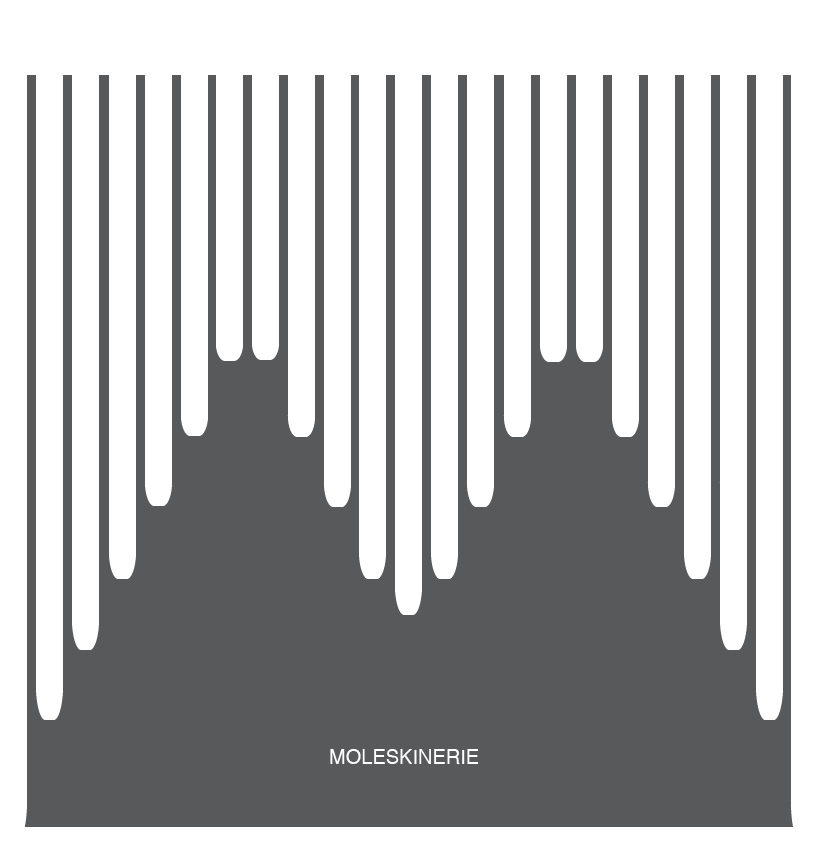
My concept is based on using the shape of the letter "M" as a basis for identifying the corporate image. As such, this basic idea is present in logos "moleskinerie1.gif" and "moleskinerie3.gif." For the other logo ("moleskinerie2.gif") thought of the elasticity of the tape that the no- tebooks have. So I ended up putting a strip in the middle of making the division of the platforms.
The process of conducting all the studies was designed using only the observation of various forms transforming them into something that represents is what I always envisioned.
moleskinerie1_Pedro Pinto
 moleskinerie2_Pedro Pinto
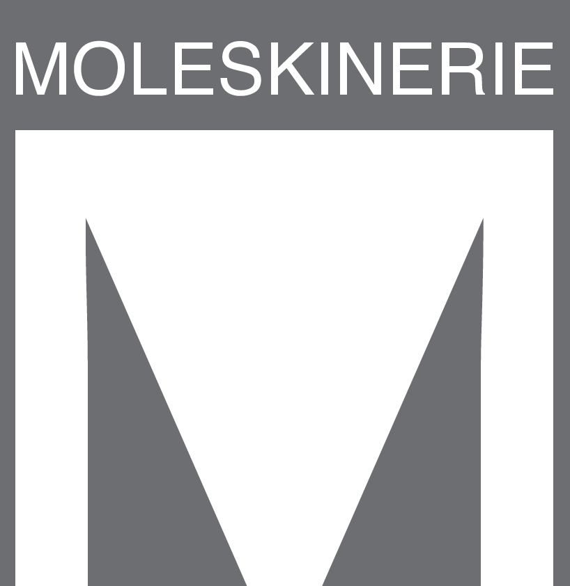 moleskinerie3_Pedro Pinto
shortlisted entries (2162)