a logoskinerie tale by teresa goncalves from portugal
designer's own words:
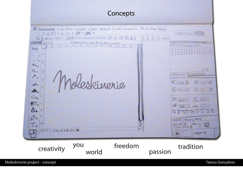
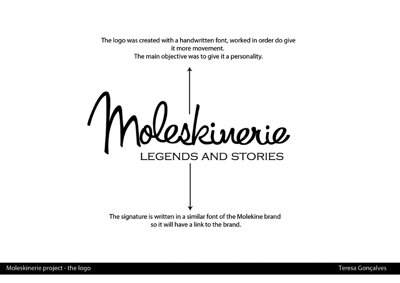
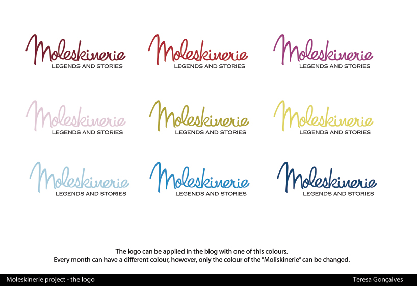
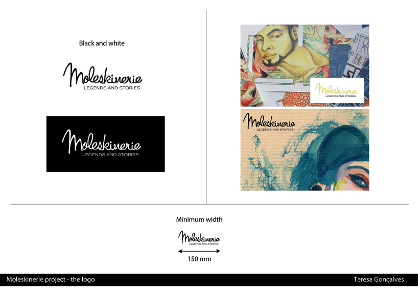
after researching the brand moliskine and the carefully reading the blog molekinerie, i saw that the logo didn’t reflect the essence of moleskinerie. it didn’t had anything to do with people or art... it lacked personality. i created a logo with a handwritten font, worked in order to be unique. i kept it simple, so the public would identify automaticly with it... like it was telling a story.... hope you like it.


shortlisted entries (2162)