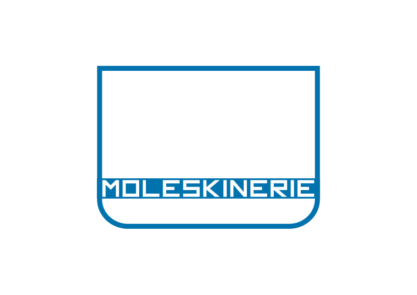
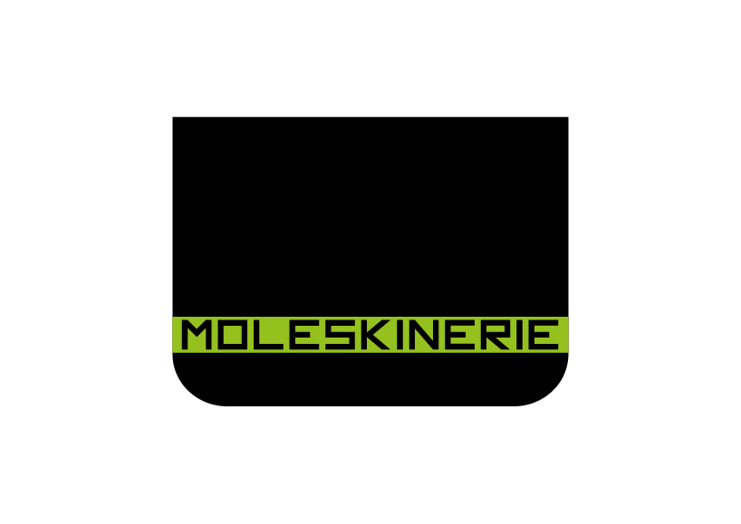
![[moleskinerie logo v1.0] by bruno domingos](https://static.designboom.com/contest/files/moleskinerie_v1_a.jpg)
[moleskinerie logo v1.0] by bruno domingos by bruno domingos from portugal
designer's own words:
the idea is simple.
moleskinerie use for there products, a very unique shape. so, having that in mind, i built a logo where the shape is the main feature and the typography is a complement for that.
for this logo is used only shapes. the font was created all by me. adobe illustrator was the tool to get the job done.
i have submitted several images to illustrate how the logo looks like with colors. combination of colors can be used.
i must say that the main shape could be only stroke, filled, or both. the typography is embedded on the rectangle, so it has the same color of the background (the notebook shape).
v1_B&W
 v2_blue
 v2_stroke
 v2_fill
shortlisted entries (2162)