the beauty of simplicity by vladimir kovach. from serbia
designer's own words:
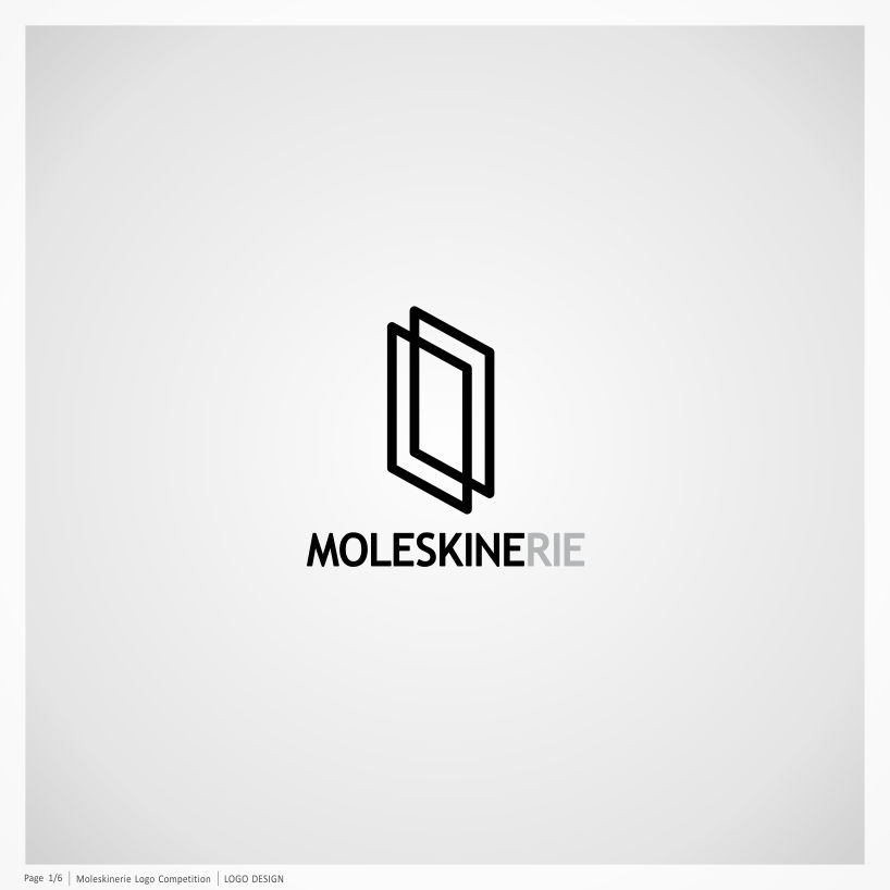
the solution of logo for a blog 'moleskinerie.com' represents visually stylized presentation of the legendary moleskine notebook. logo is consisted of transparent and elegant shape of two joined rectangles, which suggests an open and friendly communication between all fans of moleskine, by blog 'moleskinerie.com'.
furthermore, logo ″moleskinerie″ could be seen as graphic synthesis of letter symbols 'm' and 'w', where letter 'm' symbolizes 'moleskinerie' and letter 'w' stands for the letters of an abbreviation 'www - world wide web'. in this way, the importance of global connection between millions of fans of moleskine from all around the world, enabled by blog 'moleskinerie.com', is emphasized.
simple and reduced shape of logo 'moleskinerie' will provide easy recognition and successful application, in modern media (web and video), as well as in traditional (print). in addition, one of the basic qualities of logo is that it is easy to remember and simple to draw.
[moleskinerie] logo design
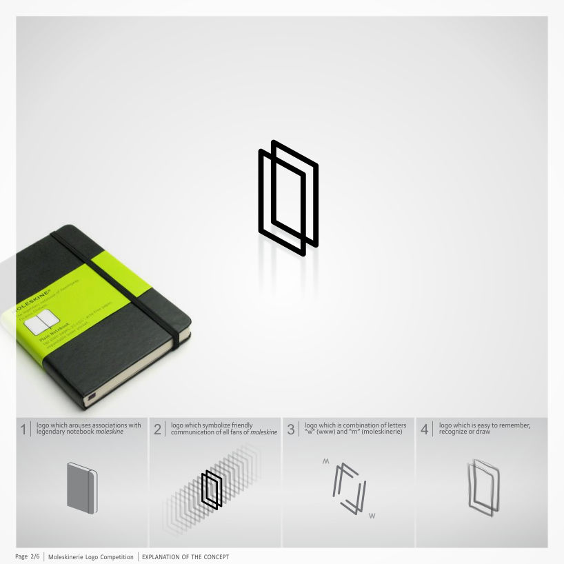 [moleskinerie] explanation of the concept
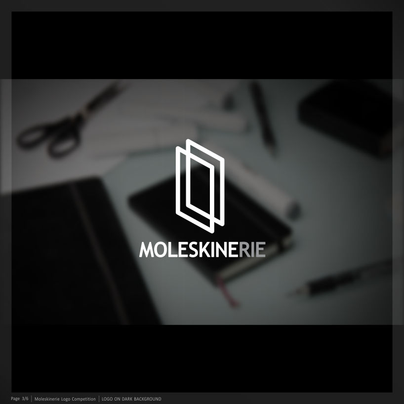 [moleskinerie] dark background
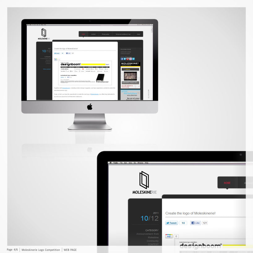 [moleskinerie] web page
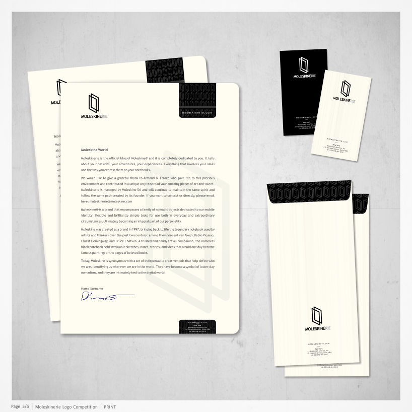 [moleskinerie] print
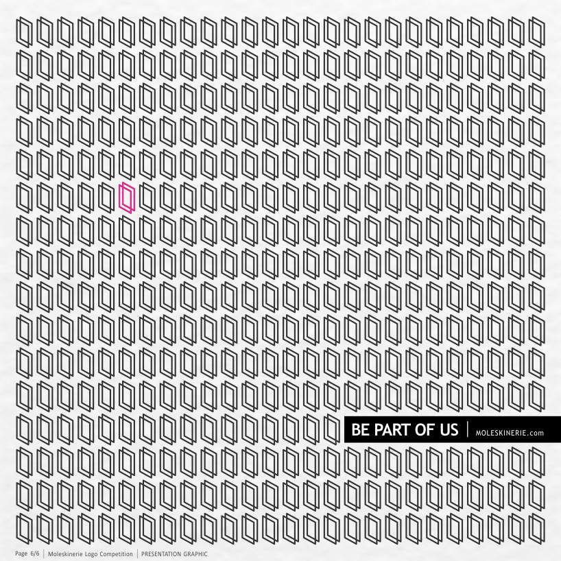 [moleskinerie] presentation graphic