more moleskine by jesus leita from spain
designer's own words:
the logo for the blog is to represent the essence of the brand. and to find this essence, what better way than searching for adjectives to define the moleskine brand. squeezing every word, every feeling that inspires the brand in general and in particular its main product.
- black notebook
- recognizable
- transcendental
- timeless
- resistant
- inspirational
- comfortable
- practical
- elegant
the next step was to find a logo that meets these same adjectives. logo and product should symbolize the same thing so that when defined, you could be talking about either one of them. two different products, a single definition.
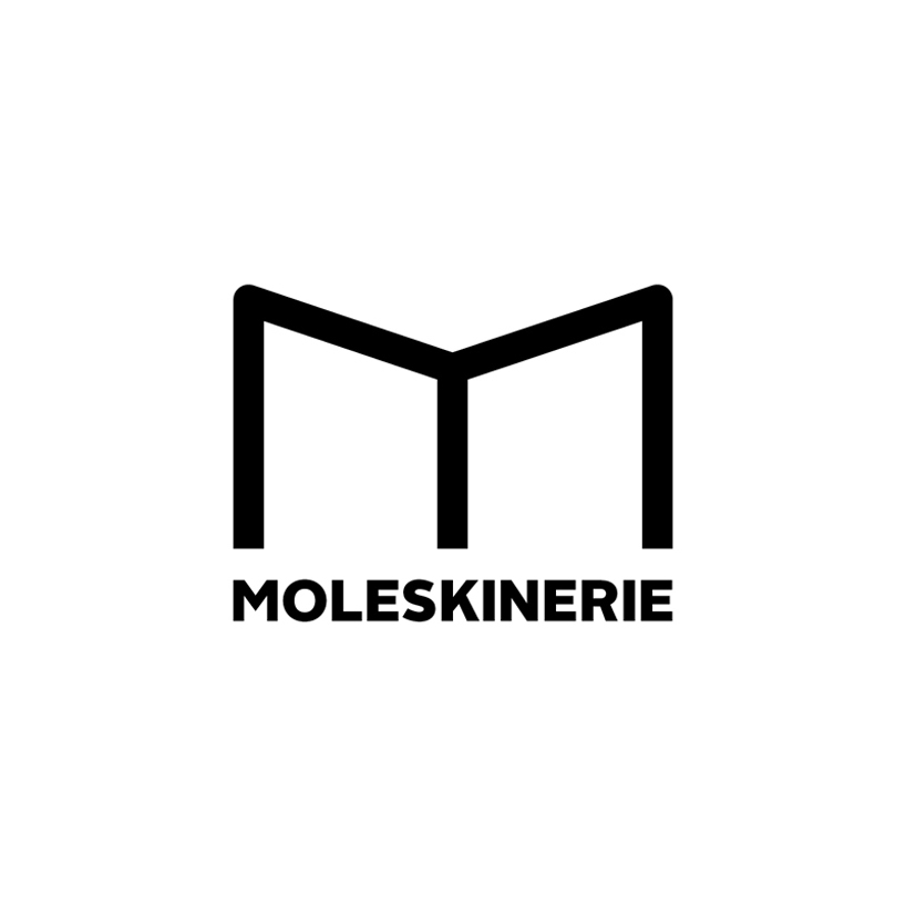
it has to be recognizable, but not limited solely to the shape of a black notebook, it must transcend. thus, i make a notebook with black covers and a white interior, which represents the notebook, but also the letter m, as a representation of the brand. the only color used is black as well resolved, because such a color is the most representative of moleskine.
of course the book has to be open since, after all, what matters is what you’re going to write in it and the support of the moleskine will make the best frame in which to transcribe your ideas.
the symbol must be distinctive and different from other similar product logos. a logo that represents something as simple as a book can become a symbol. something as simple as an m, it can become a brand.
it is important for it to be practical, manageable, applicable to any medium. a logo that works in positive, negative and different sizes, even the smallest.
it must be timeless. the brand still maintains its essence after two centuries, the logo should continue to work above fashion, over the years.
the logo, as the brand is simple, clear, elegant.
moleskinerie logo
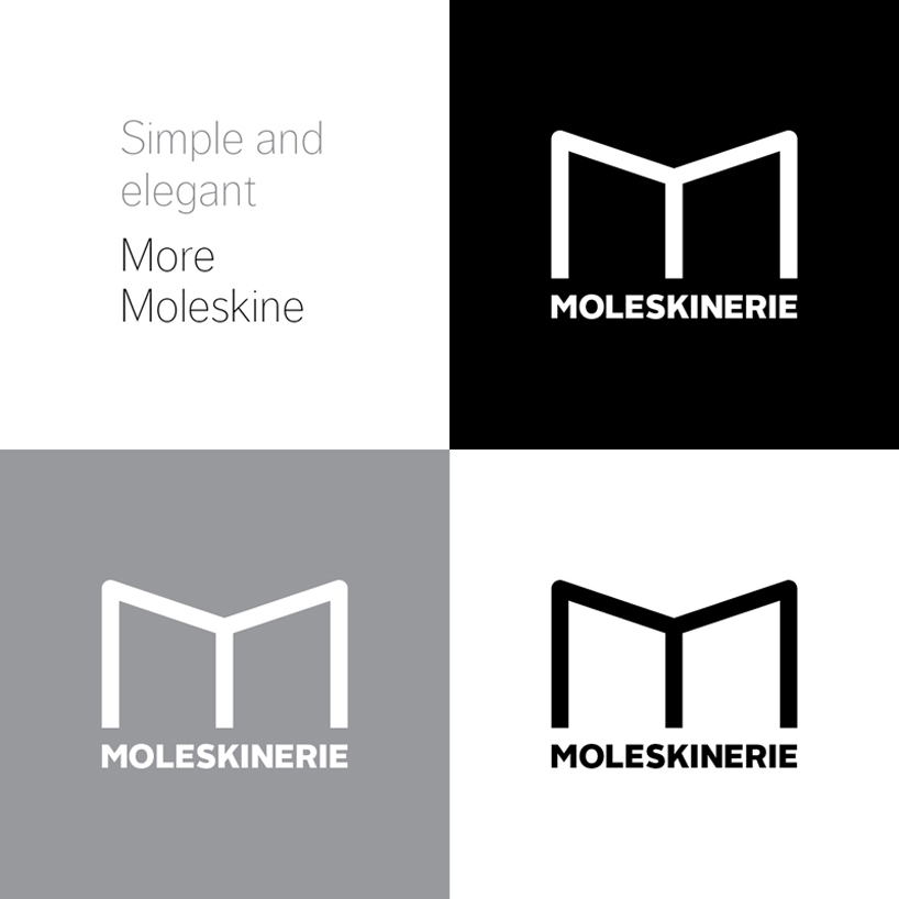 positive-negative
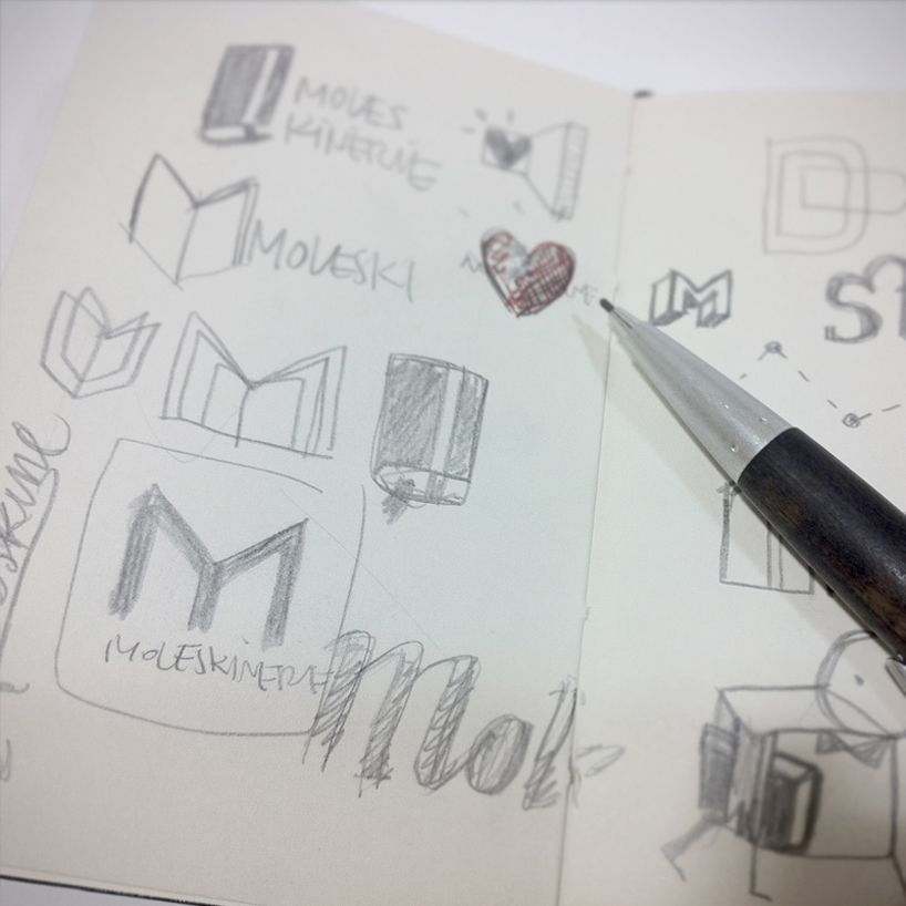 logo sketch