Moleskinerie Logo Design Competition Proposal by rusudan margishvili from usa
designer's own words:
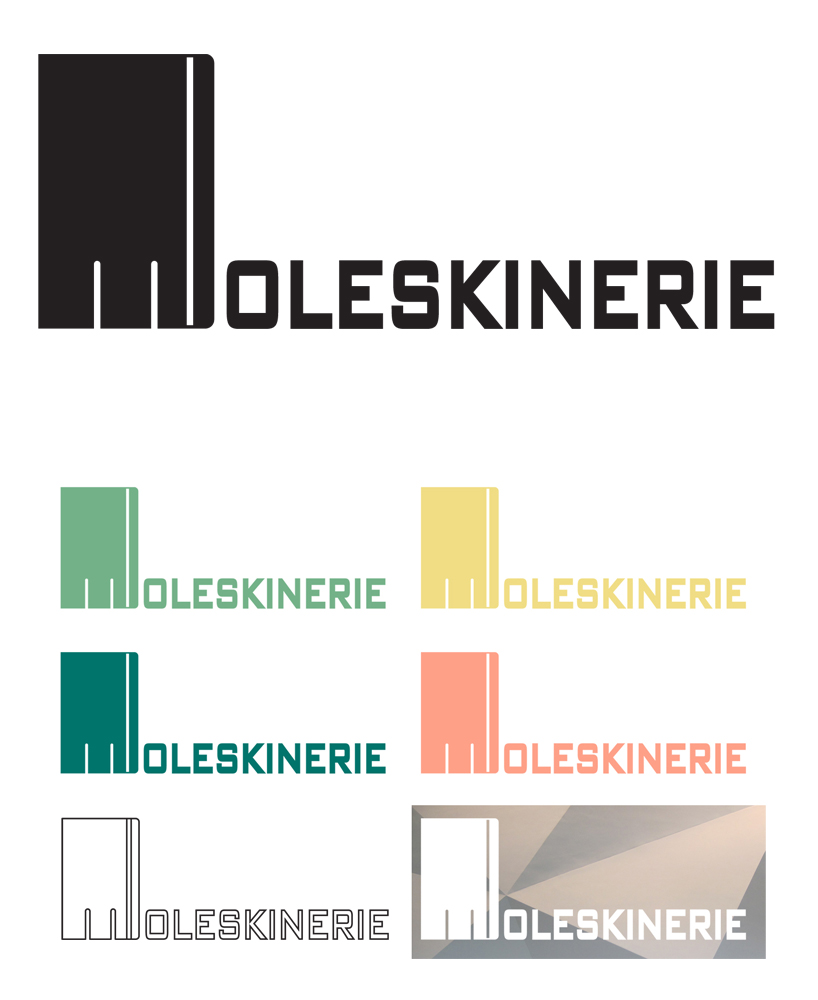
Whenever I hear Moleskine, an image of a black notebook with an elastic band comes to my mind. The notebook is elegant and simple, without any extras. I used this image as a concept for my logo proposal.
The shape of Moleskine notebooks was used for the first letter. The cuts defining the M are short, in order to keep the notebook shape more dominant. Other letters are simple, with rounded corners. M could be used as a separate symbol or together with the rest of the text.
The primary color is black, though the logo can have any other color or shade according to the need. This allows a universal use of the symbol. Logo can work on different backgrounds and photographs.
And finally, I think the simplicity gives the logo a great flexibility. Moreover, it can easily be identified with Moleskine and its marvelous products.
Proposal 1