moleskinerie 001 by erika choquet by erika choquet from uk
designer's own words:
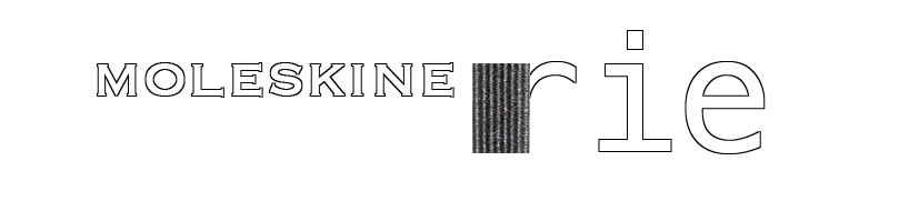
moleskinerie 001 - sense of balance -
“moleskinerie” is divided in two words to emphasize the original name of moleskine.
only the outline of the actual logo of moleskine is kept for a more bright and modern representation. the incorporation of a portion of elastic provide a support for the suffix "rie", it is introduce in a larger scale to keep in balance with the entire composition.
the logo is composed as a balance between the past "moleskine" and new "rie" at the precise point of balance.
001
 002
002
shortlisted entries (2162)