erika choquet is moleskinering by erika choquet from uk
designer's own words:
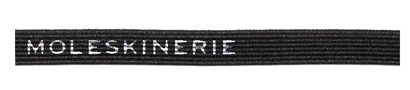
introducing a portion of the elastic used to close the moleskine´s notebooks for this new logo, improve the direct relationship between "moleskinerie" and the brand.
keep the typography used by moleskine is a crucial aspect to maintain this close relationship. the simplicity and the endurance of the original moleskine logo is indicative of the quality of products and it is essential to continue with the same representation.
moleskinerie 002 - imprint -
following the same idea of keeping a representative portion of a moleskine´s product, we are using in this case the elastic in a horizontal position. reference is made to a timeline, the name is situated in the right side as the origin and we keep the left side as a future space expecting to grow to enhance the constant evolution of the brand. “moleskinerie” is maintain as a single name with the original typography as a print on the fabric to provide deeper and realistic image.
002